4 Clustering
4.1 Introduction
Clustering attempts to find groups (clusters) of similar objects. The members of a cluster should be more similar to each other, than to objects in other clusters. Clustering algorithms aim to minimize intra-cluster variation and maximize inter-cluster variation.
Methods of clustering can be broadly divided into two types:
Hierarchic techniques produce dendrograms (trees) through a process of division or agglomeration.
Partitioning algorithms divide objects into non-overlapping subsets (examples include k-means and DBSCAN)
![Example clusters. **A**, *blobs*; **B**, *aggregation* [@Gionis2007]; **C**, *noisy moons*; **D**, *different density*; **E**, *anisotropic distributions*; **F**, *no structure*.](03-clustering_files/figure-html/clusterTypes-1.png)
Figure 4.1: Example clusters. A, blobs; B, aggregation (Gionis, Mannila, and Tsaparas 2007); C, noisy moons; D, different density; E, anisotropic distributions; F, no structure.
4.2 Distance metrics
Various distance metrics can be used with clustering algorithms. We will use Euclidean distance in the examples and exercises in this chapter.
\[\begin{equation} distance\left(p,q\right)=\sqrt{\sum_{i=1}^{n} (p_i-q_i)^2} \tag{4.1} \end{equation}\]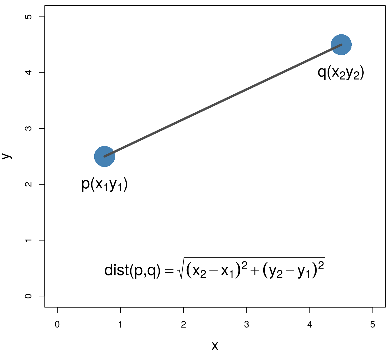
Figure 4.2: Euclidean distance.
4.3 Hierarchic agglomerative
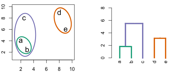
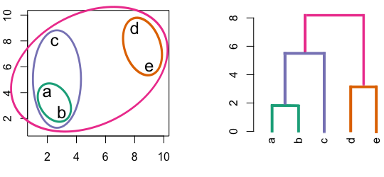
Figure 4.3: Building a dendrogram using hierarchic agglomerative clustering.
4.3.1 Linkage algorithms
| A | B | C | D | |
|---|---|---|---|---|
| B | 2 | |||
| C | 6 | 5 | ||
| D | 10 | 10 | 5 | |
| E | 9 | 8 | 3 | 4 |
Single linkage - nearest neighbours linkage
Complete linkage - furthest neighbours linkage
Average linkage - UPGMA (Unweighted Pair Group Method with Arithmetic Mean)
| Groups | Single | Complete | Average |
|---|---|---|---|
| A,B,C,D,E | 0 | 0 | 0.0 |
| (A,B),C,D,E | 2 | 2 | 2.0 |
| (A,B),(C,E),D | 3 | 3 | 3.0 |
| (A,B)(C,D,E) | 4 | 5 | 4.5 |
| (A,B,C,D,E) | 5 | 10 | 8.0 |
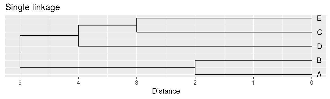
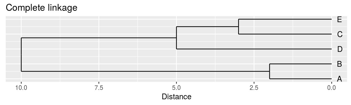
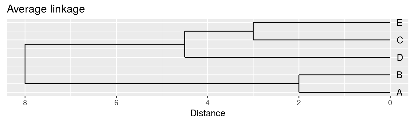
Figure 4.4: Dendrograms for the example distance matrix using three different linkage methods.
4.4 K-means
4.4.1 Algorithm
Pseudocode for the K-means algorithm
randomly choose k objects as initial centroids
while true:
  1. create k clusters by assigning each object to closest centroid
  2. compute k new centroids by averaging the objects in each cluster
  3. if none of the centroids differ from the previous iteration:
        return the current set of clusters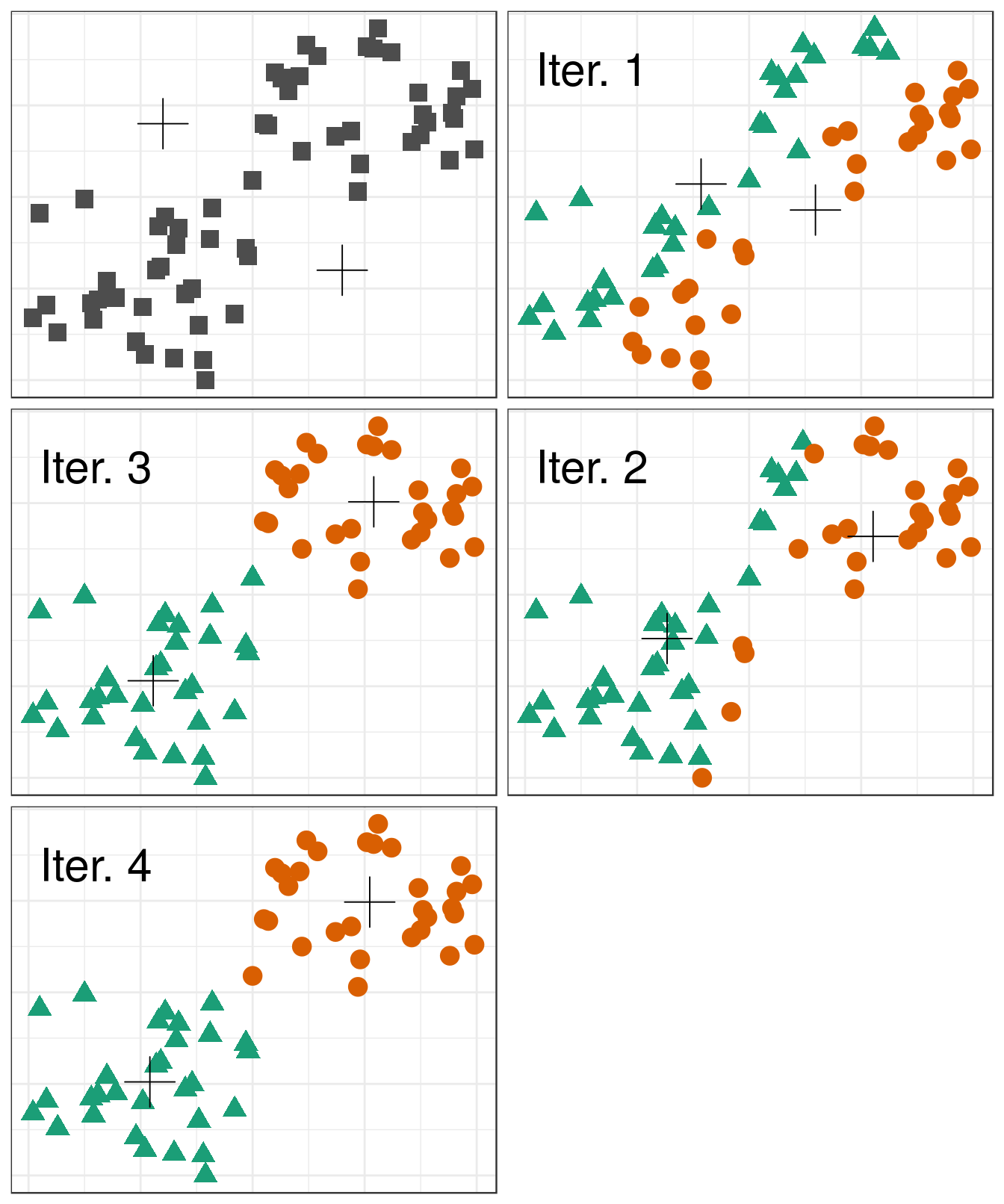
Figure 4.5: Iterations of the k-means algorithm
The default setting of the kmeans function is to perform a maximum of 10 iterations and if the algorithm fails to converge a warning is issued. The maximum number of iterations is set with the argument iter.max.
4.4.2 Choosing initial cluster centres
library(RColorBrewer)
point_shapes <- c(15,17,19)
point_colours <- brewer.pal(3,"Dark2")
point_size = 1.5
center_point_size = 8

blobs <- as.data.frame(read.csv("data/example_clusters/blobs.csv", header=F))

good_centres <- as.data.frame(matrix(c(2,8,7,3,12,7), ncol=2, byrow=T))
bad_centres <- as.data.frame(matrix(c(13,13,8,12,2,2), ncol=2, byrow=T))

good_result <- kmeans(blobs[,1:2], centers=good_centres)
bad_result <- kmeans(blobs[,1:2], centers=bad_centres)

plotList <- list(
ggplot(blobs, aes(V1,V2)) +
  geom_point(col=point_colours[good_result$cluster], shape=point_shapes[good_result$cluster],
             size=point_size) +
  geom_point(data=good_centres, aes(V1,V2), shape=3, col="black", size=center_point_size) +
  theme_bw(),
ggplot(blobs, aes(V1,V2)) +
  geom_point(col=point_colours[bad_result$cluster], shape=point_shapes[bad_result$cluster],
             size=point_size) +
  geom_point(data=bad_centres, aes(V1,V2), shape=3, col="black", size=center_point_size) +
  theme_bw()
)

pm <- ggmatrix(
  plotList, nrow=1, ncol=2, showXAxisPlotLabels = T, showYAxisPlotLabels = T,
  xAxisLabels=c("A", "B")
) + theme_bw()

pm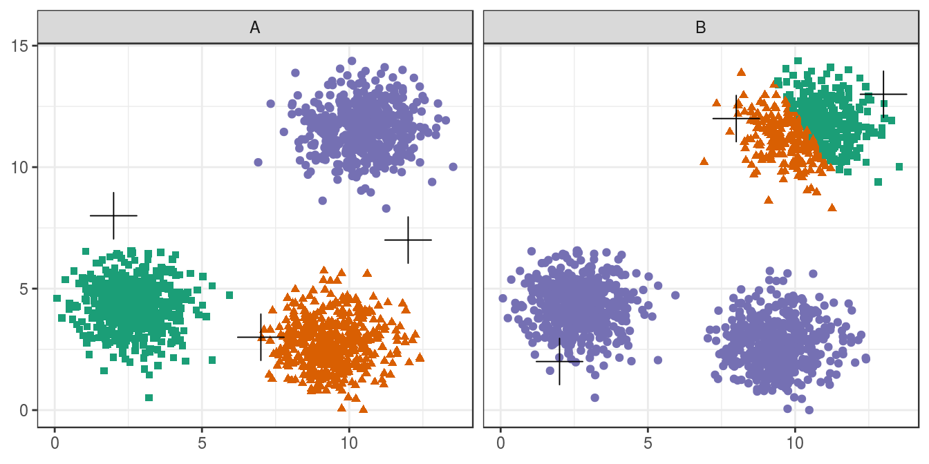
Figure 4.6: Initial centres determine clusters. The starting centres are shown as crosses. A, real clusters found; B, convergence to a local minimum.
Convergence to a local minimum can be avoided by starting the algorithm multiple times, with different random centres. The nstart argument to the k-means function can be used to specify the number of random sets and optimal solution will be selected automatically.
4.4.3 Choosing k
point_colours <- brewer.pal(9,"Set1")
k <- 1:9
res <- lapply(k, function(i){kmeans(blobs[,1:2], i, nstart=50)})

plotList <- lapply(k, function(i){
  ggplot(blobs, aes(V1, V2)) +
    geom_point(col=point_colours[res[[i]]$cluster], size=1) +
    geom_point(data=as.data.frame(res[[i]]$centers), aes(V1,V2), shape=3, col="black", size=5) +
    annotate("text", x=2, y=13, label=paste("k=", i, sep=""), size=8, col="black") +
    theme_bw()
}
)

pm <- ggmatrix(
  plotList, nrow=3, ncol=3, showXAxisPlotLabels = T, showYAxisPlotLabels = T
) + theme_bw()

pm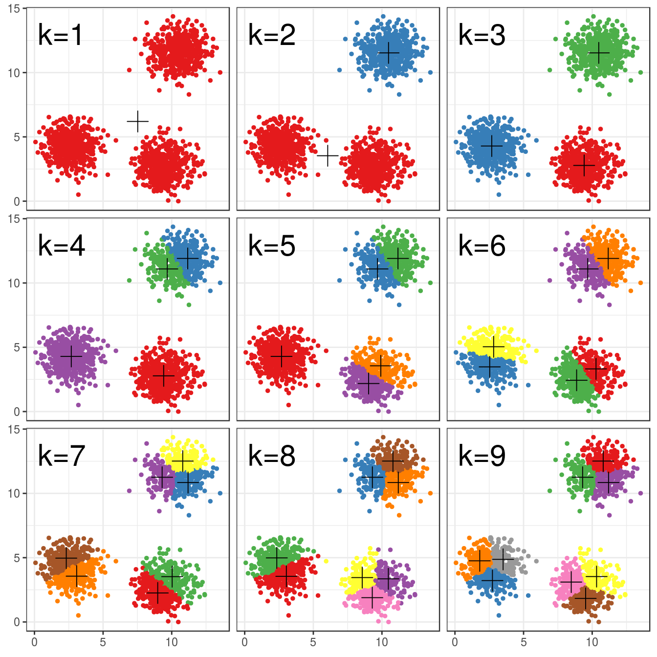
Figure 4.7: K-means clustering of the blobs data set using a range of values of k from 1-9. Cluster centres indicated with a cross.
tot_withinss <- sapply(k, function(i){res[[i]]$tot.withinss})
qplot(k, tot_withinss, geom=c("point", "line"),
      ylab="Total within-cluster sum of squares") + theme_bw()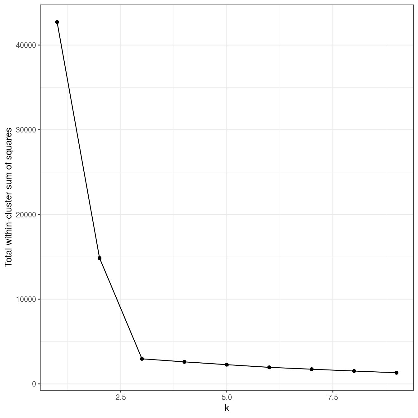
Figure 4.8: Variance within the clusters. Total within-cluster sum of squares plotted against k.
N.B. we have set nstart=50 to run the algorithm 50 times, starting from different, random sets of centroids.
4.5 DBSCAN
Density-based spatial clustering of applications with noise
4.5.1 Algorithm
Abstract DBSCAN algorithm in pseudocode (Schubert et al. 2017)
1 Compute neighbours of each point and identify core points   // Identify core points
2 Join neighbouring core points into clusters                 // Assign core points
3 foreach non-core point do
      Add to a neighbouring core point if possible            // Assign border points
Otherwise, add to noise // Assign noise points![Illustration of the DBSCAN algorithm. By Chire (Own work) [CC BY-SA 3.0 (http://creativecommons.org/licenses/by-sa/3.0)], via Wikimedia Commons.](images/DBSCAN_Illustration.svg)
Figure 4.9: Illustration of the DBSCAN algorithm. By Chire (Own work) [CC BY-SA 3.0 (http://creativecommons.org/licenses/by-sa/3.0)], via Wikimedia Commons.
The method requires two parameters; MinPts that is the minimum number of samples in any cluster; Eps that is the maximum distance of the sample to at least one other sample within the same cluster.
This algorithm works on a parametric approach. The two parameters involved in this algorithm are:
- e (eps) is the radius of our neighborhoods around a data point p.
- minPts is the minimum number of data points we want in a neighborhood to define a cluster.
4.5.2 Implementation in R
DBSCAN is implemented in two R packages: dbscan and fpc. We will use the package dbscan, because it is significantly faster and can handle larger data sets than fpc. The function has the same name in both packages and so if for any reason both packages have been loaded into our current workspace, there is a danger of calling the wrong implementation. To avoid this we can specify the package name when calling the function, e.g.:
dbscan::dbscanWe load the dbscan package in the usual way:
library(dbscan)4.5.3 Choosing parameters
The algorithm only needs parameteres eps and minPts.
Read in data and use kNNdist function from dbscan package to plot the distances of the 10-nearest neighbours for each observation (figure 4.10).
blobs <- read.csv("data/example_clusters/blobs.csv", header=F)
kNNdistplot(blobs[,1:2], k=10)
abline(h=0.6)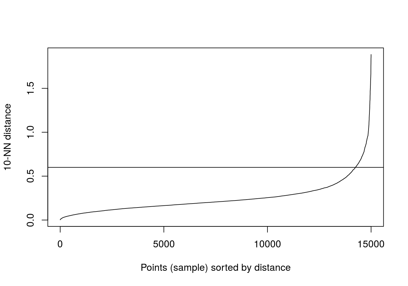
Figure 4.10: 10-nearest neighbour distances for the blobs data set
res <- dbscan::dbscan(blobs[,1:2], eps=0.6, minPts = 10)
table(res$cluster)
##
## 0 1 2 3
## 43 484 486 487ggplot(blobs, aes(V1,V2)) +
geom_point(col=brewer.pal(8,"Dark2")[c(8,1:7)][res$cluster+1],
shape=c(4,15,17,19)[res$cluster+1],
size=1.5) +
theme_bw()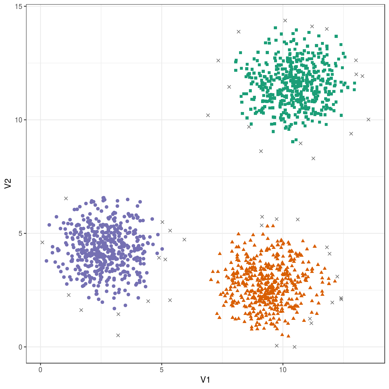
Figure 4.11: DBSCAN clustering (eps=0.6, minPts=10) of the blobs data set. Outlier observations are shown as grey crosses.
4.6 Example: clustering synthetic data sets
4.6.1 Hierarchic agglomerative
4.6.1.1 Step-by-step instructions
- Load required packages.
library(RColorBrewer)
library(dendextend)
##
## ---------------------
## Welcome to dendextend version 1.9.0
## Type citation('dendextend') for how to cite the package.
##
## Type browseVignettes(package = 'dendextend') for the package vignette.
## The github page is: https://github.com/talgalili/dendextend/
##
## Suggestions and bug-reports can be submitted at: https://github.com/talgalili/dendextend/issues
## Or contact: <tal.galili@gmail.com>
##
## To suppress this message use: suppressPackageStartupMessages(library(dendextend))
## ---------------------##
## Attaching package: 'dendextend'## The following object is masked from 'package:ggdendro':
##
## theme_dendro## The following object is masked from 'package:stats':
##
## cutreelibrary(ggplot2)
library(GGally)- Retrieve a palette of eight colours.
cluster_colours <- brewer.pal(8,"Dark2")- Read in data for blobs example.
blobs <- read.csv("data/example_clusters/blobs.csv", header=F)- Create distance matrix using Euclidean distance metric.
d <- dist(blobs[,1:2])- Perform hierarchical clustering using the average agglomeration method and convert the result to an object of class dendrogram. A dendrogram object can be edited using the advanced features of the dendextend package.
dend <- as.dendrogram(hclust(d, method="average"))- Cut the tree into three clusters
clusters <- cutree(dend,3,order_clusters_as_data=F)- The vector clusters contains the cluster membership (in this case 1, 2 or 3) of each observation (data point) in the order they appear on the dendrogram. We can use this vector to colour the branches of the dendrogram by cluster.
dend <- color_branches(dend, clusters=clusters, col=cluster_colours[1:3])- We can use the labels function to annotate the leaves of the dendrogram. However, it is not possible to create legible labels for the 1,500 leaves in our example dendrogram, so we will set the label for each leaf to an empty string.
labels(dend) <- rep("", length(blobs[,1]))- If we want to plot the dendrogram using ggplot, we must convert it to an object of class ggdend.
ggd <- as.ggdend(dend)- The nodes attribute of ggd is a data.frame of parameters related to the plotting of dendogram nodes. The nodes data.frame contains some NAs which will generate warning messages when ggd is processed by ggplot. Since we are not interested in annotating dendrogram nodes, the easiest option here is to delete all of the rows of nodes.
ggd$nodes <- ggd$nodes[!(1:length(ggd$nodes[,1])),]- We can use the cluster membership of each observation contained in the vector clusters to assign colours to the data points of a scatterplot. However, first we need to reorder the vector so that the cluster memberships are in the same order that the observations appear in the data.frame of observations. Fortunately the names of the elements of the vector are the indices of the observations in the data.frame and so reordering can be accomplished in one line.
clusters <- clusters[order(as.numeric(names(clusters)))]- We are now ready to plot a dendrogram and scatterplot. We will use the ggmatrix function from the GGally package to place the plots side-by-side.
plotList <- list(ggplot(ggd),
                 ggplot(blobs, aes(V1,V2)) +
                   geom_point(col=cluster_colours[clusters], size=0.2)
                 )

pm <- ggmatrix(
  plotList, nrow=1, ncol=2, showXAxisPlotLabels = F, showYAxisPlotLabels = F,
  xAxisLabels=c("dendrogram", "scatter plot")
) + theme_bw()

pm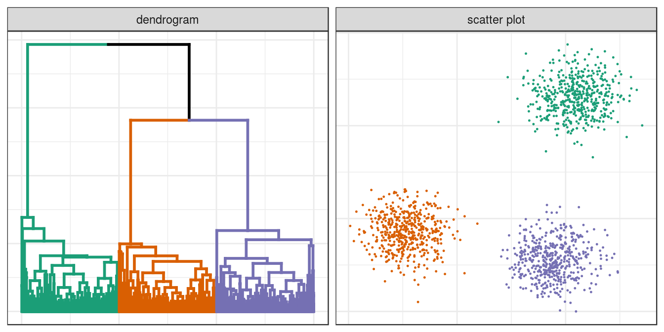
Figure 4.12: Hierarchical clustering of the blobs data set.
4.6.1.2 Clustering of other synthetic data sets
aggregation <- read.table("data/example_clusters/aggregation.txt")
noisy_moons <- read.csv("data/example_clusters/noisy_moons.csv", header=F)
diff_density <- read.csv("data/example_clusters/different_density.csv", header=F)
aniso <- read.csv("data/example_clusters/aniso.csv", header=F)
no_structure <- read.csv("data/example_clusters/no_structure.csv", header=F)

hclust_plots <- function(data_set, n){
  d <- dist(data_set[,1:2])
  dend <- as.dendrogram(hclust(d, method="average"))
  clusters <- cutree(dend,n,order_clusters_as_data=F)
  dend <- color_branches(dend, clusters=clusters, col=cluster_colours[1:n])
  clusters <- clusters[order(as.numeric(names(clusters)))]
  labels(dend) <- rep("", length(data_set[,1]))
  ggd <- as.ggdend(dend)
  ggd$nodes <- ggd$nodes[!(1:length(ggd$nodes[,1])),]
  plotPair <- list(ggplot(ggd),
    ggplot(data_set, aes(V1,V2)) +
      geom_point(col=cluster_colours[clusters], size=0.2))
  return(plotPair)
}

plotList <- c(
  hclust_plots(aggregation, 7),
  hclust_plots(noisy_moons, 2),
  hclust_plots(diff_density, 2),
  hclust_plots(aniso, 3),
  hclust_plots(no_structure, 3)
)

pm <- ggmatrix(
  plotList, nrow=5, ncol=2, showXAxisPlotLabels = F, showYAxisPlotLabels = F,
  xAxisLabels=c("dendrogram", "scatter plot"),
  yAxisLabels=c("aggregation", "noisy moons", "different density", "anisotropic", "no structure")
) + theme_bw()

pm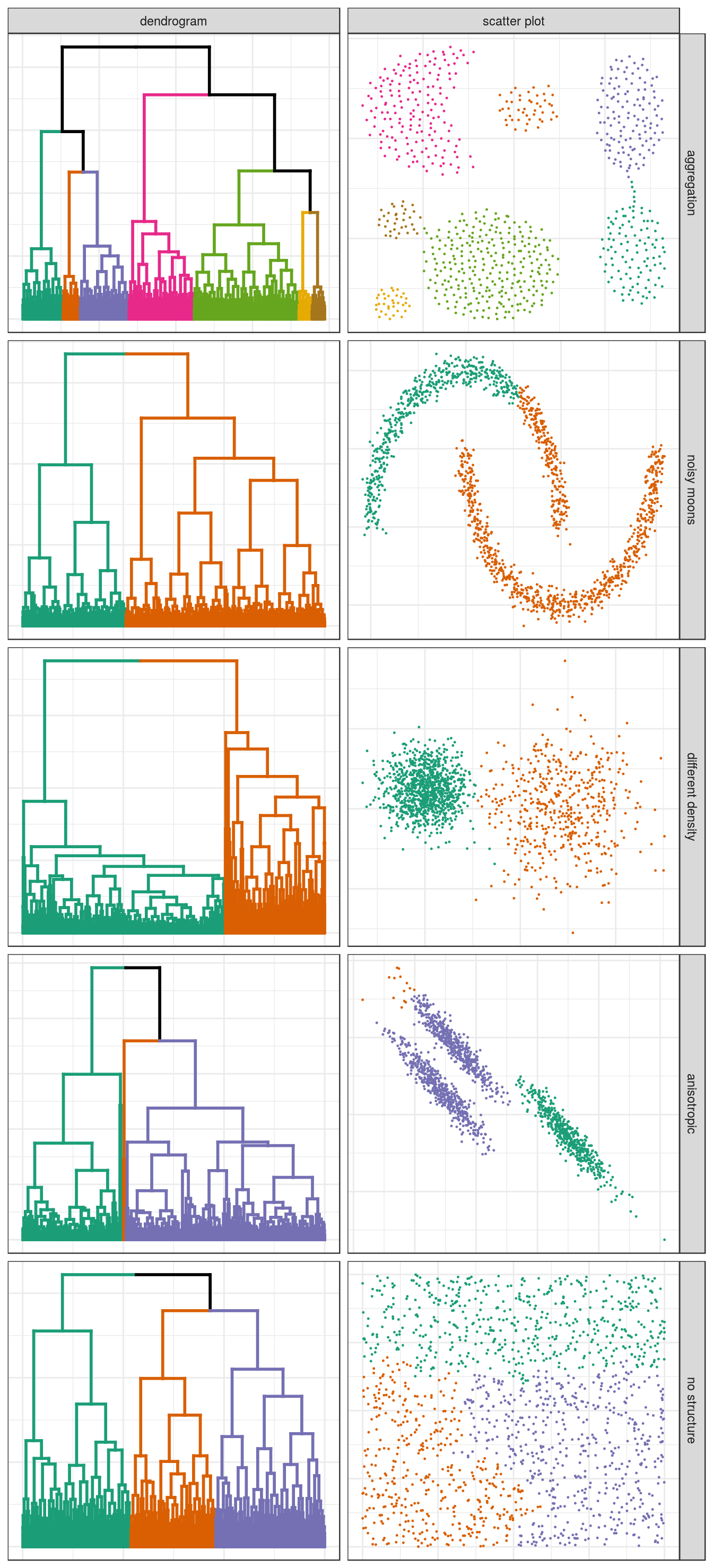
Figure 4.13: Hierarchical clustering of synthetic data-sets.
4.6.2 K-means
Earlier we saw how k-means performed on the blobs data set. Let’s see how k-means performs on the other toy data sets. First we will define some variables and functions we will use in the analysis of all data sets.
k=1:9
point_shapes <- c(15,17,19,5,6,0,1)
point_colours <- brewer.pal(7,"Dark2")
point_size = 1.5
center_point_size = 8

plot_tot_withinss <- function(kmeans_output){
  tot_withinss <- sapply(k, function(i){kmeans_output[[i]]$tot.withinss})
  qplot(k, tot_withinss, geom=c("point", "line"),
        ylab="Total within-cluster sum of squares") + theme_bw()
}

plot_clusters <- function(data_set, kmeans_output, num_clusters){
    ggplot(data_set, aes(V1,V2)) +
    geom_point(col=point_colours[kmeans_output[[num_clusters]]$cluster],
               shape=point_shapes[kmeans_output[[num_clusters]]$cluster],
               size=point_size) +
    geom_point(data=as.data.frame(kmeans_output[[num_clusters]]$centers), aes(V1,V2),
               shape=3,col="black",size=center_point_size) +
    theme_bw()
}
4.6.2.1 Aggregation
aggregation <- as.data.frame(read.table("data/example_clusters/aggregation.txt"))
res <- lapply(k, function(i){kmeans(aggregation[,1:2], i, nstart=50)})
plot_tot_withinss(res)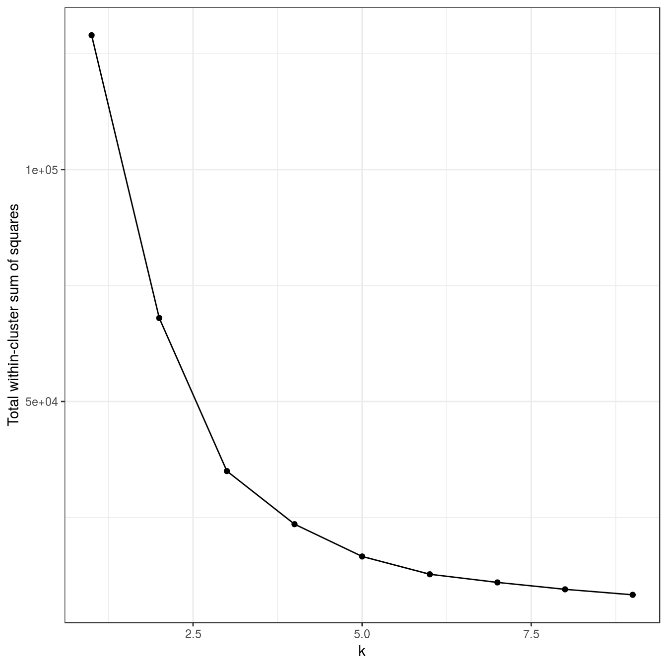
Figure 4.14: K-means clustering of the aggregation data set: variance within clusters.
plotList <- list(
  plot_clusters(aggregation, res, 3),
  plot_clusters(aggregation, res, 7)
)
pm <- ggmatrix(
  plotList, nrow=1, ncol=2, showXAxisPlotLabels = T, showYAxisPlotLabels = T,
  xAxisLabels=c("k=3", "k=7")
) + theme_bw()
pm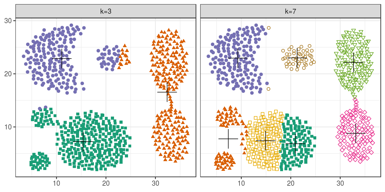
Figure 4.15: K-means clustering of the aggregation data set: scatterplots of clusters for k=3 and k=7. Cluster centres indicated with a cross.
4.6.2.2 Noisy moons
noisy_moons <- read.csv("data/example_clusters/noisy_moons.csv", header=F)
res <- lapply(k, function(i){kmeans(noisy_moons[,1:2], i, nstart=50)})
plot_tot_withinss(res)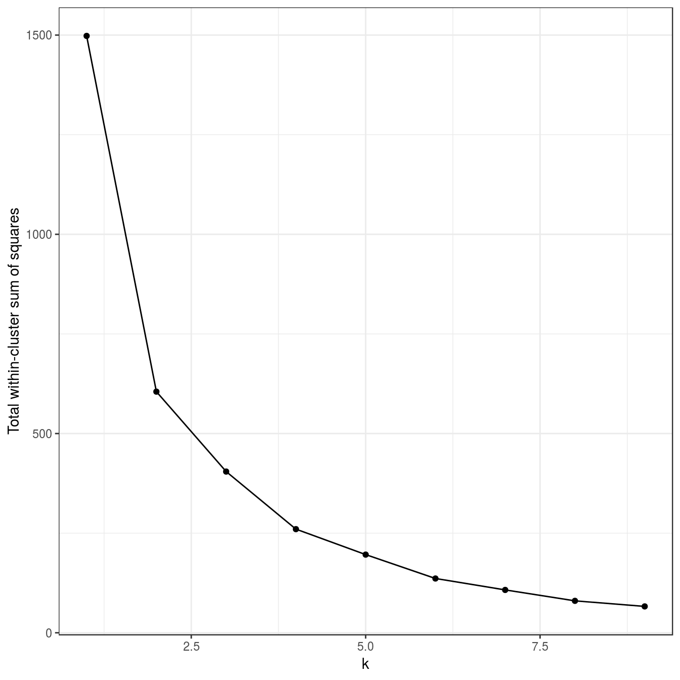
Figure 4.16: K-means clustering of the noisy moons data set: variance within clusters.
plot_clusters(noisy_moons, res, 2)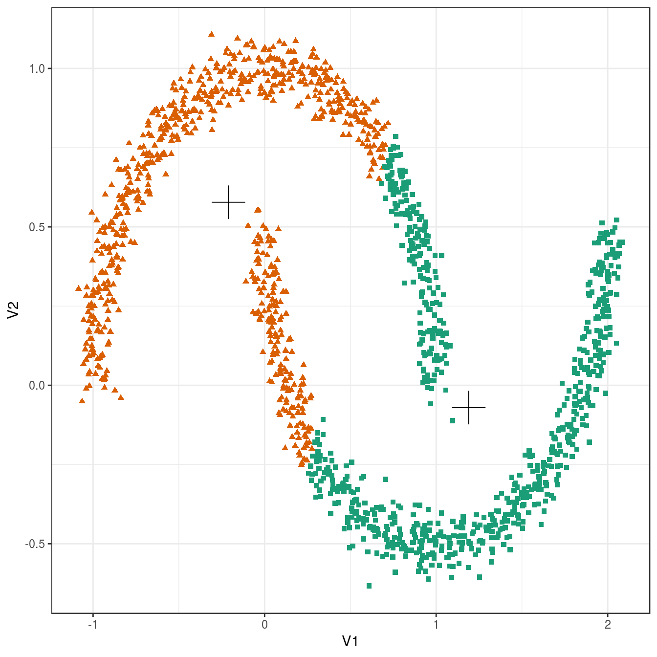
Figure 4.17: K-means clustering of the noisy moons data set: scatterplot of clusters for k=2. Cluster centres indicated with a cross.
4.6.2.3 Different density
diff_density <- as.data.frame(read.csv("data/example_clusters/different_density.csv", header=F))
res <- lapply(k, function(i){kmeans(diff_density[,1:2], i, nstart=50)})
## Warning: did not converge in 10 iterations
## Warning: did not converge in 10 iterations
## Warning: did not converge in 10 iterations
## Warning: did not converge in 10 iterationsFailure to converge, so increase number of iterations.
res <- lapply(k, function(i){kmeans(diff_density[,1:2], i, iter.max=20, nstart=50)})
plot_tot_withinss(res)
Figure 4.18: K-means clustering of the different density distributions data set: variance within clusters.
plot_clusters(diff_density, res, 2)
Figure 4.19: K-means clustering of the different density distributions data set: scatterplots of clusters for k=2 and k=3. Cluster centres indicated with a cross.
4.6.2.4 Anisotropic distributions
aniso <- as.data.frame(read.csv("data/example_clusters/aniso.csv", header=F))
res <- lapply(k, function(i){kmeans(aniso[,1:2], i, nstart=50)})
plot_tot_withinss(res)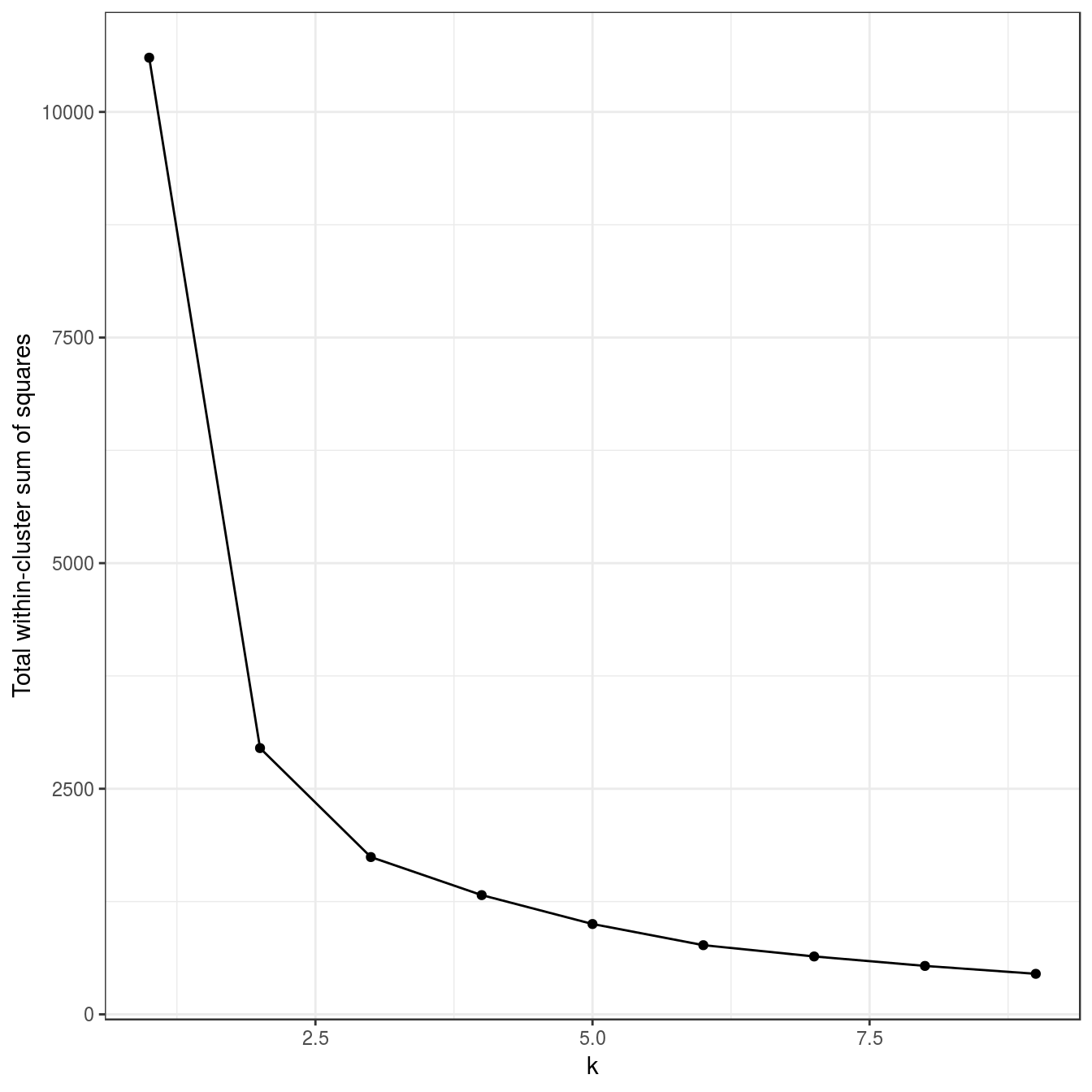
Figure 4.20: K-means clustering of the anisotropic distributions data set: variance within clusters.
plotList <- list(
  plot_clusters(aniso, res, 2),
  plot_clusters(aniso, res, 3)
)
pm <- ggmatrix(
  plotList, nrow=1, ncol=2, showXAxisPlotLabels = T,
  showYAxisPlotLabels = T, xAxisLabels=c("k=2", "k=3")
) + theme_bw()
pm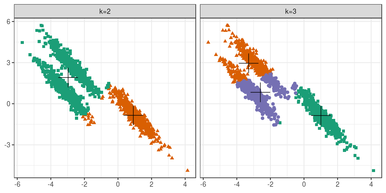
Figure 4.21: K-means clustering of the anisotropic distributions data set: scatterplots of clusters for k=2 and k=3. Cluster centres indicated with a cross.
4.6.2.5 No structure
no_structure <- as.data.frame(read.csv("data/example_clusters/no_structure.csv", header=F))
res <- lapply(k, function(i){kmeans(no_structure[,1:2], i, nstart=50)})
plot_tot_withinss(res)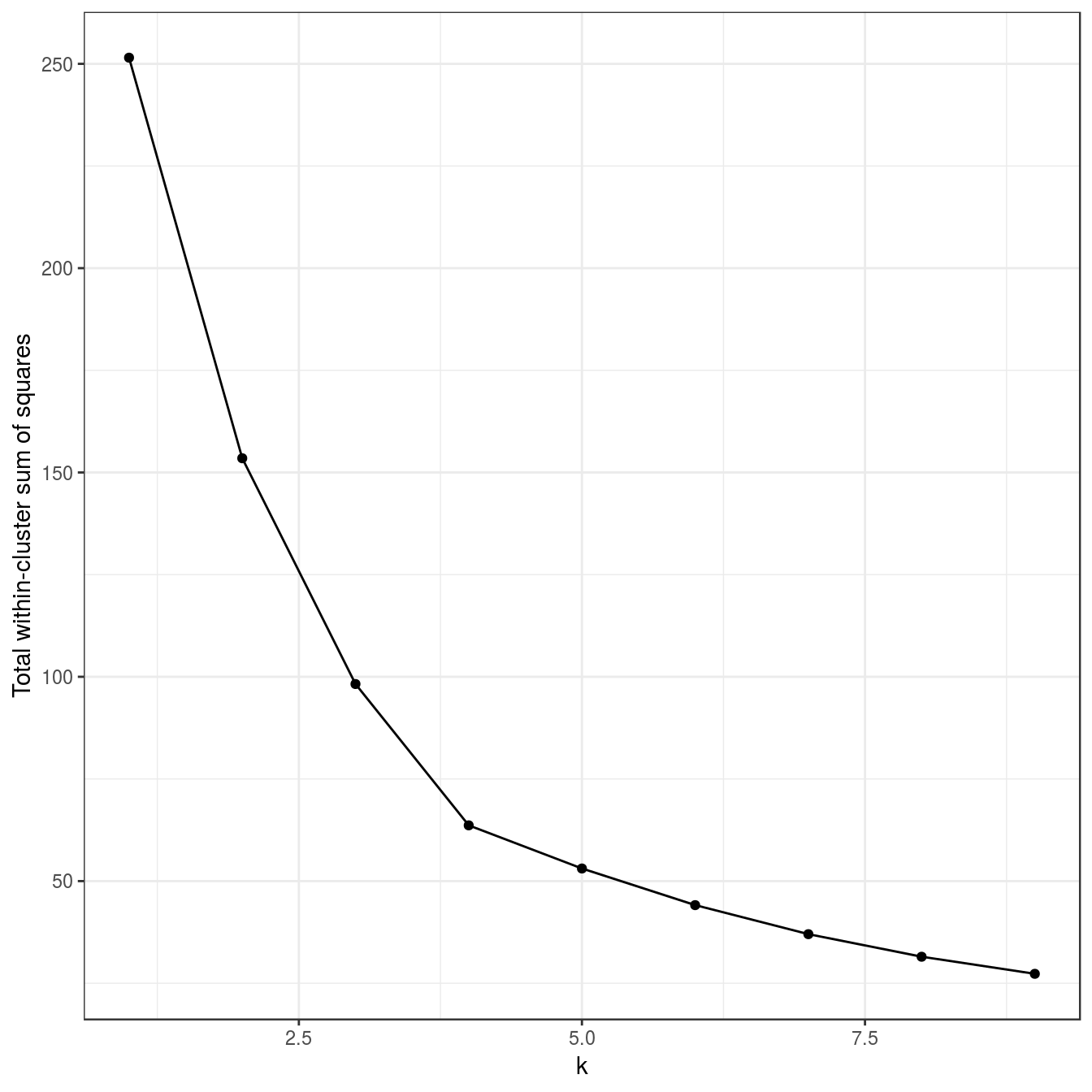
Figure 4.22: K-means clustering of the data set with no structure: variance within clusters.
plot_clusters(no_structure, res, 4)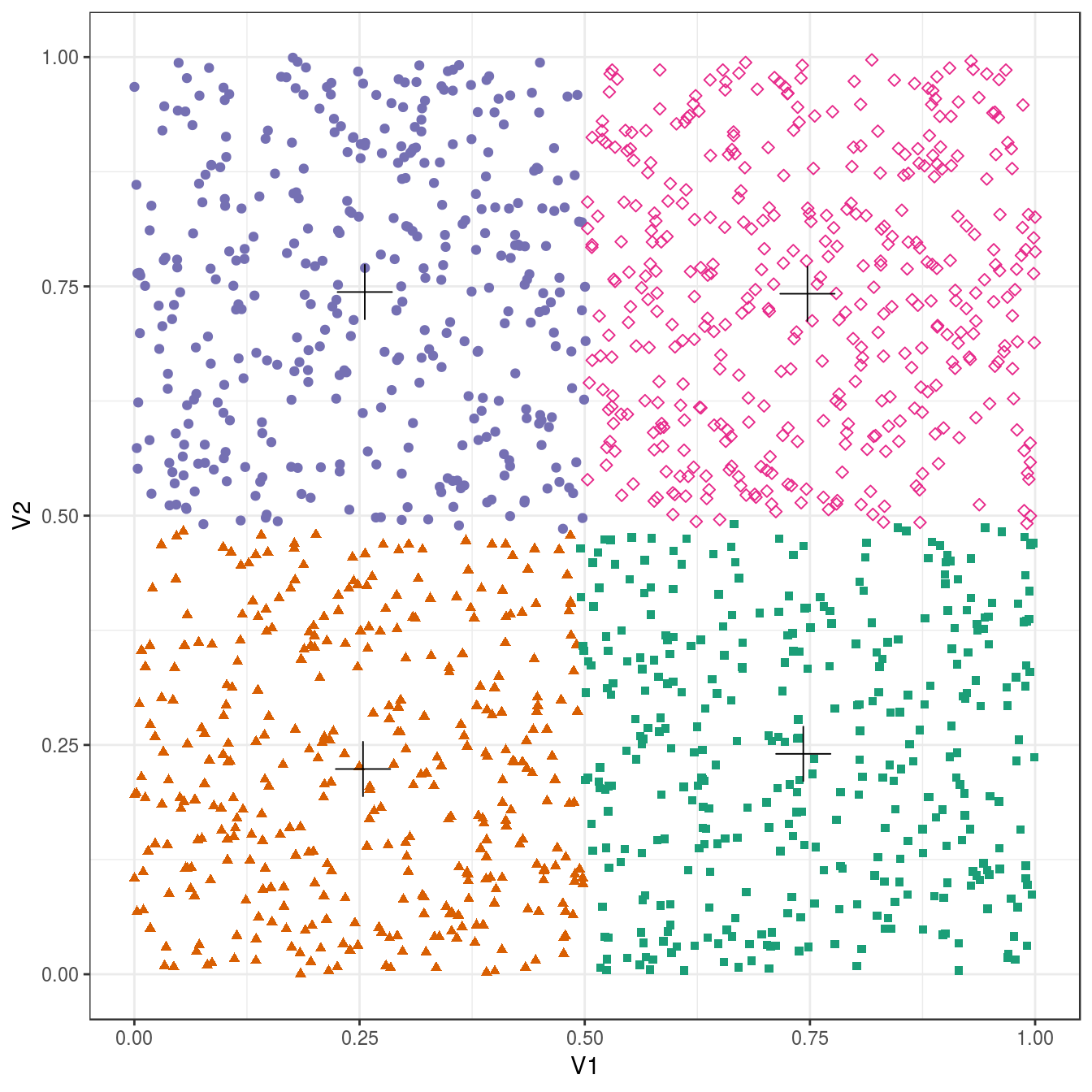
Figure 4.23: K-means clustering of the data set with no structure: scatterplot of clusters for k=4. Cluster centres indicated with a cross.
4.6.3 DBSCAN
Prepare by defining some variables and a plotting function.
point_shapes <- c(4,15,17,19,5,6,0,1)
point_colours <- brewer.pal(8,"Dark2")[c(8,1:7)]
point_size = 1.5
center_point_size = 8

plot_dbscan_clusters <- function(data_set, dbscan_output){
  ggplot(data_set, aes(V1,V2)) +
    geom_point(col=point_colours[dbscan_output$cluster+1],
               shape=point_shapes[dbscan_output$cluster+1],
               size=point_size) +
    theme_bw()
}
4.6.3.1 Aggregation
aggregation <- read.table("data/example_clusters/aggregation.txt")
kNNdistplot(aggregation[,1:2], k=10)
abline(h=1.8)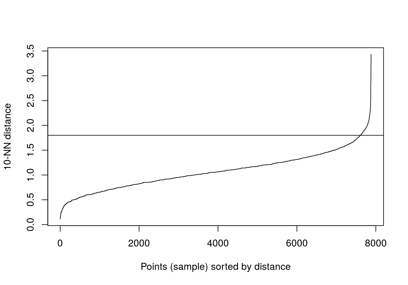
Figure 4.24: 10-nearest neighbour distances for the aggregation data set
res <- dbscan::dbscan(aggregation[,1:2], eps=1.8, minPts = 10)
table(res$cluster)
##
## 0 1 2 3 4 5 6
## 2 168 307 105 127 45 34plot_dbscan_clusters(aggregation, res)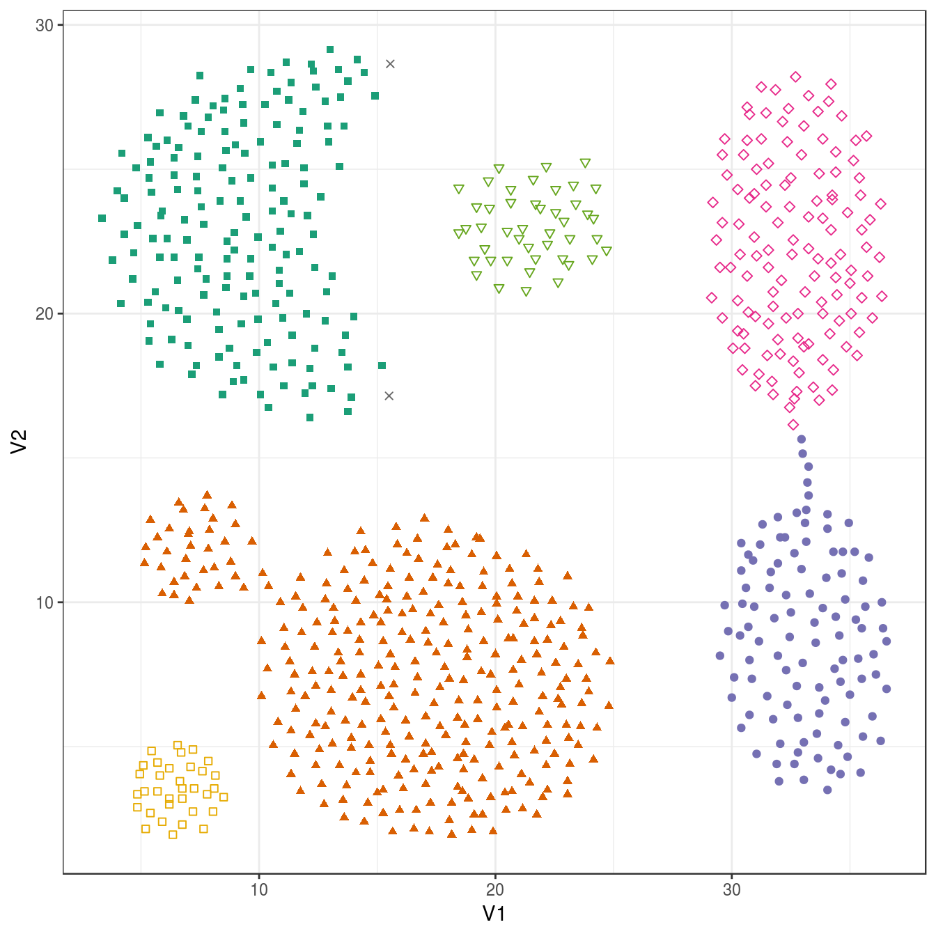
Figure 4.25: DBSCAN clustering (eps=1.8, minPts=10) of the aggregation data set. Outlier observations are shown as grey crosses.
4.6.3.2 Noisy moons
noisy_moons <- read.csv("data/example_clusters/noisy_moons.csv", header=F)
kNNdistplot(noisy_moons[,1:2], k=10)
abline(h=0.075)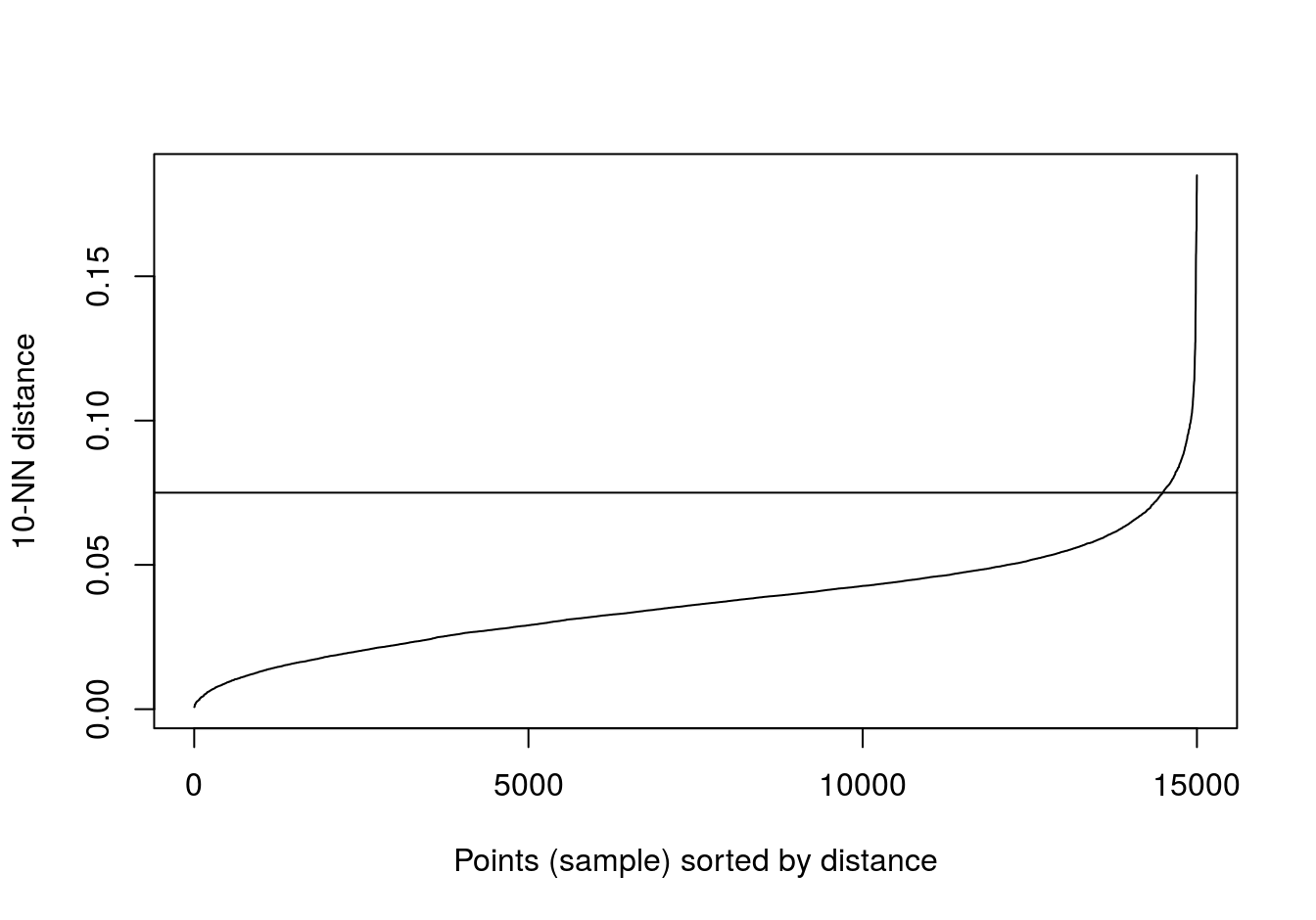
Figure 4.26: 10-nearest neighbour distances for the noisy moons data set
res <- dbscan::dbscan(noisy_moons[,1:2], eps=0.075, minPts = 10)
table(res$cluster)
##
## 0 1 2
## 8 748 744plot_dbscan_clusters(noisy_moons, res)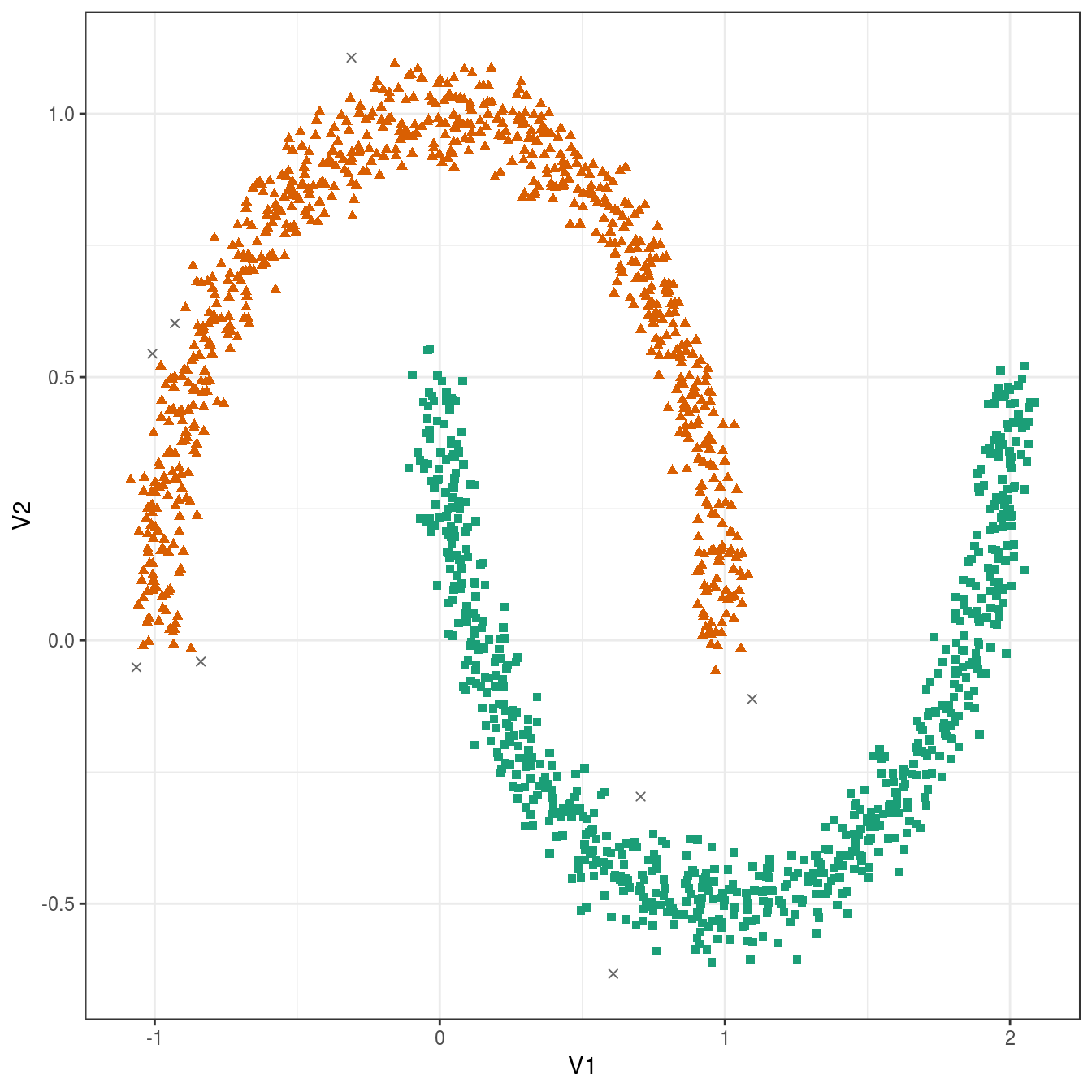
Figure 4.27: DBSCAN clustering (eps=0.075, minPts=10) of the noisy moons data set. Outlier observations are shown as grey crosses.
4.6.3.3 Different density
diff_density <- read.csv("data/example_clusters/different_density.csv", header=F)
kNNdistplot(diff_density[,1:2], k=10)
abline(h=0.9)
abline(h=0.6, lty=2)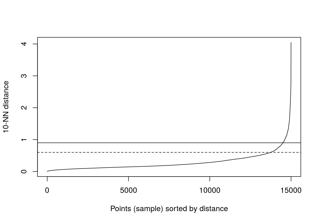
Figure 4.28: 10-nearest neighbour distances for the different density distributions data set
res <- dbscan::dbscan(diff_density[,1:2], eps=0.9, minPts = 10)
table(res$cluster)
##
## 0 1
## 40 1460plot_dbscan_clusters(diff_density, res)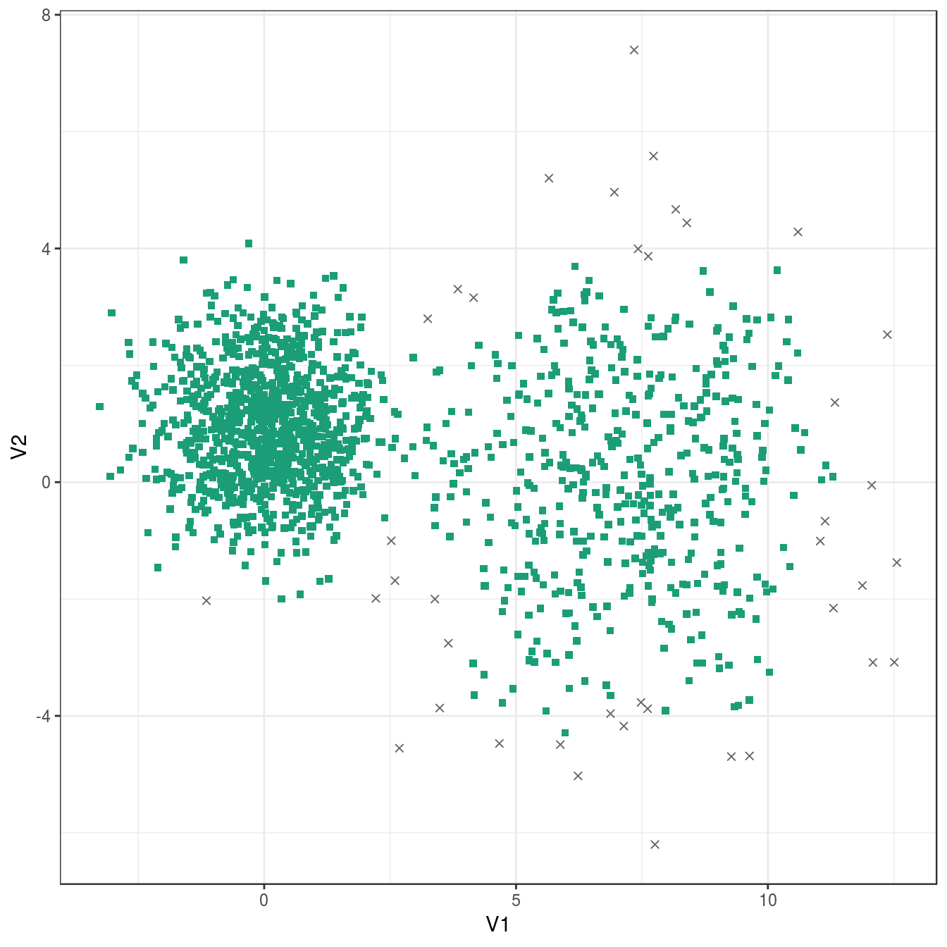
Figure 4.29: DBSCAN clustering of the different density distribution data set with eps=0.9 and minPts=10. Outlier observations are shown as grey crosses.
res <- dbscan::dbscan(diff_density[,1:2], eps=0.6, minPts = 10)
table(res$cluster)
##
## 0 1 2
## 109 399 992plot_dbscan_clusters(diff_density, res)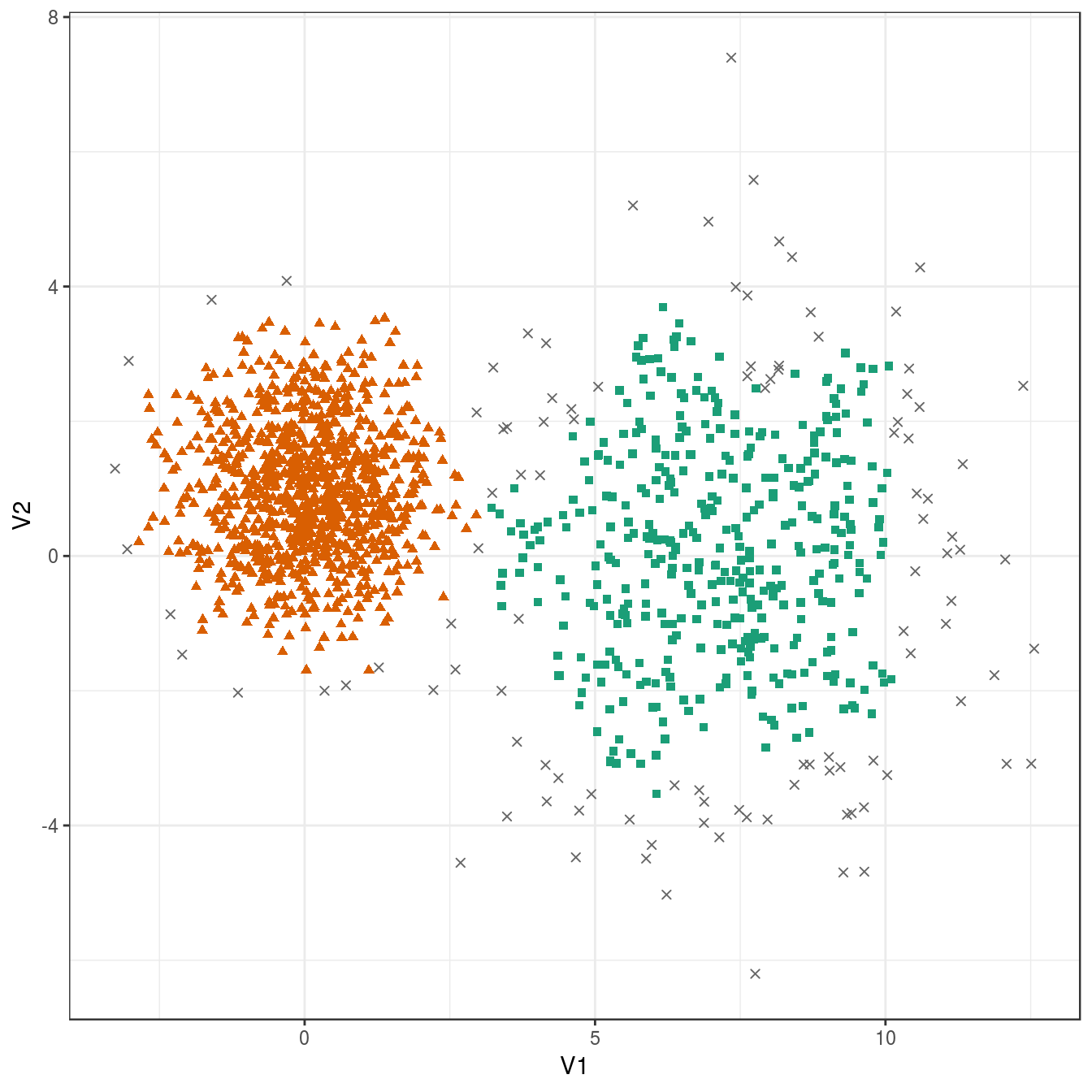
Figure 4.30: DBSCAN clustering of the different density distribution data set with eps=0.6 and minPts=10. Outlier observations are shown as grey crosses.
4.6.3.4 Anisotropic distributions
aniso <- read.csv("data/example_clusters/aniso.csv", header=F)
kNNdistplot(aniso[,1:2], k=10)
abline(h=0.35)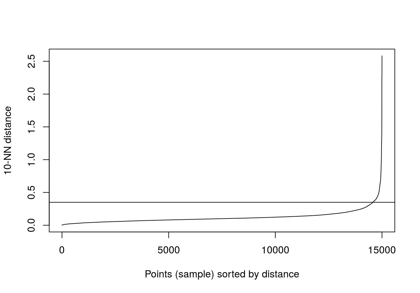
Figure 4.31: 10-nearest neighbour distances for the anisotropic distributions data set
res <- dbscan::dbscan(aniso[,1:2], eps=0.35, minPts = 10)
table(res$cluster)
##
## 0 1 2 3
## 29 489 488 494plot_dbscan_clusters(aniso, res)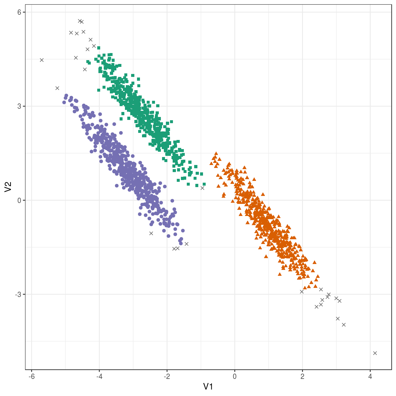
Figure 4.32: DBSCAN clustering (eps=0.3, minPts=10) of the anisotropic distributions data set. Outlier observations are shown as grey crosses.
4.6.3.5 No structure
no_structure <- read.csv("data/example_clusters/no_structure.csv", header=F)
kNNdistplot(no_structure[,1:2], k=10)
abline(h=0.057)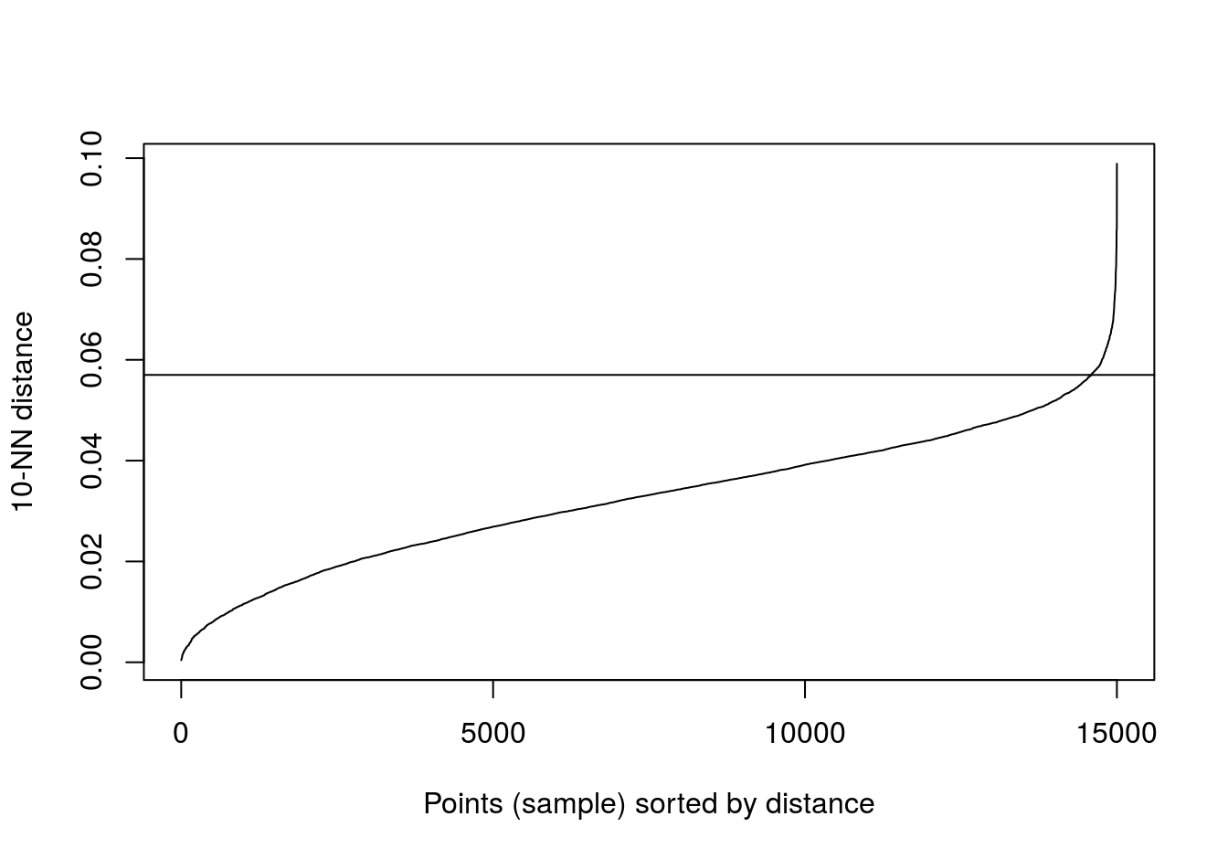
Figure 4.33: 10-nearest neighbour distances for the data set with no structure.
res <- dbscan::dbscan(no_structure[,1:2], eps=0.57, minPts = 10)
table(res$cluster)
##
## 1
## 15004.7 Evaluating cluster quality
4.7.1 Silhouette method
Silhouette \[\begin{equation} s(i) = \frac{b(i) - a(i)}{max\left(a(i),b(i)\right)} \tag{4.2} \end{equation}\]Where
- a(i) - average dissimmilarity of i with all other data within the cluster. a(i) can be interpreted as how well i is assigned to its cluster (the smaller the value, the better the assignment).
- b(i) - the lowest average dissimilarity of i to any other cluster, of which i is not a member.
Observations with a large s(i) (close to 1) are very well clustered. Observations lying between clusters will have a small s(i) (close to 0). If an observation has a negative s(i), it has probably been placed in the wrong cluster.
4.7.2 Example - k-means clustering of blobs data set
Load library required for calculating silhouette coefficients and plotting silhouettes.
library(cluster)We are going to take another look at k-means clustering of the blobs data-set (figure 4.7). Specifically we are going to see if silhouette analysis supports our original choice of k=3 as the optimum number of clusters (figure 4.8).
Silhouette analysis requires a minimum of two clusters, so we’ll try values of k from 2 to 9.
k <- 2:9Create a palette of colours for plotting.
kColours <- brewer.pal(9,"Set1")Perform k-means clustering for each value of k from 2 to 9.
res <- lapply(k, function(i){kmeans(blobs[,1:2], i, nstart=50)})Calculate the Euclidean distance matrix
d <- dist(blobs[,1:2])Silhouette plot for k=2
s2 <- silhouette(res[[2-1]]$cluster, d)
plot(s2, border=NA, col=kColours[sort(res[[2-1]]$cluster)], main="")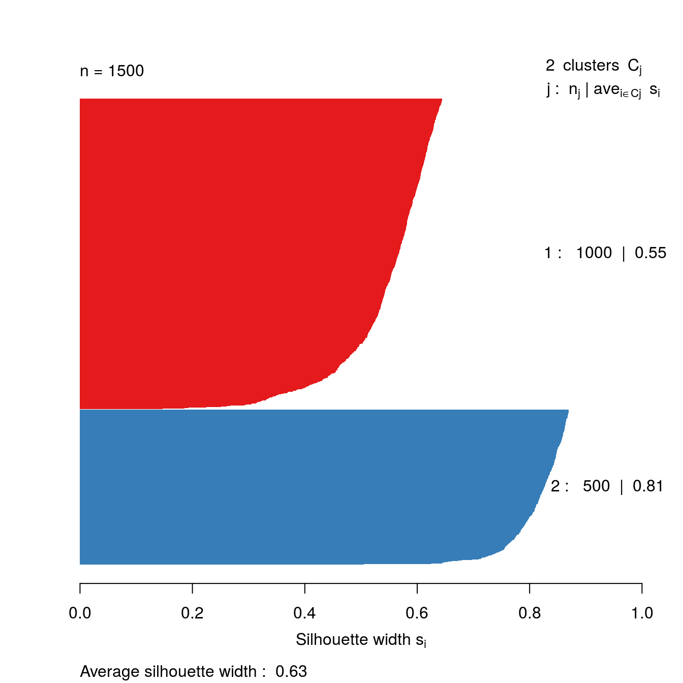
Figure 4.34: Silhouette plot for k-means clustering of the blobs data set with k=2.
Silhouette plot for k=9
s9 <- silhouette(res[[9-1]]$cluster, d)
plot(s9, border=NA, col=kColours[sort(res[[9-1]]$cluster)], main="")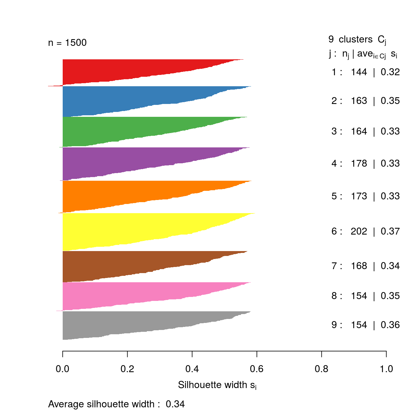
Figure 4.35: Silhouette plot for k-means clustering of the blobs data set with k=9.
Let’s take a look at the silhouette plot for k=3.
s3 <- silhouette(res[[3-1]]$cluster, d)
plot(s3, border=NA, col=kColours[sort(res[[3-1]]$cluster)], main="")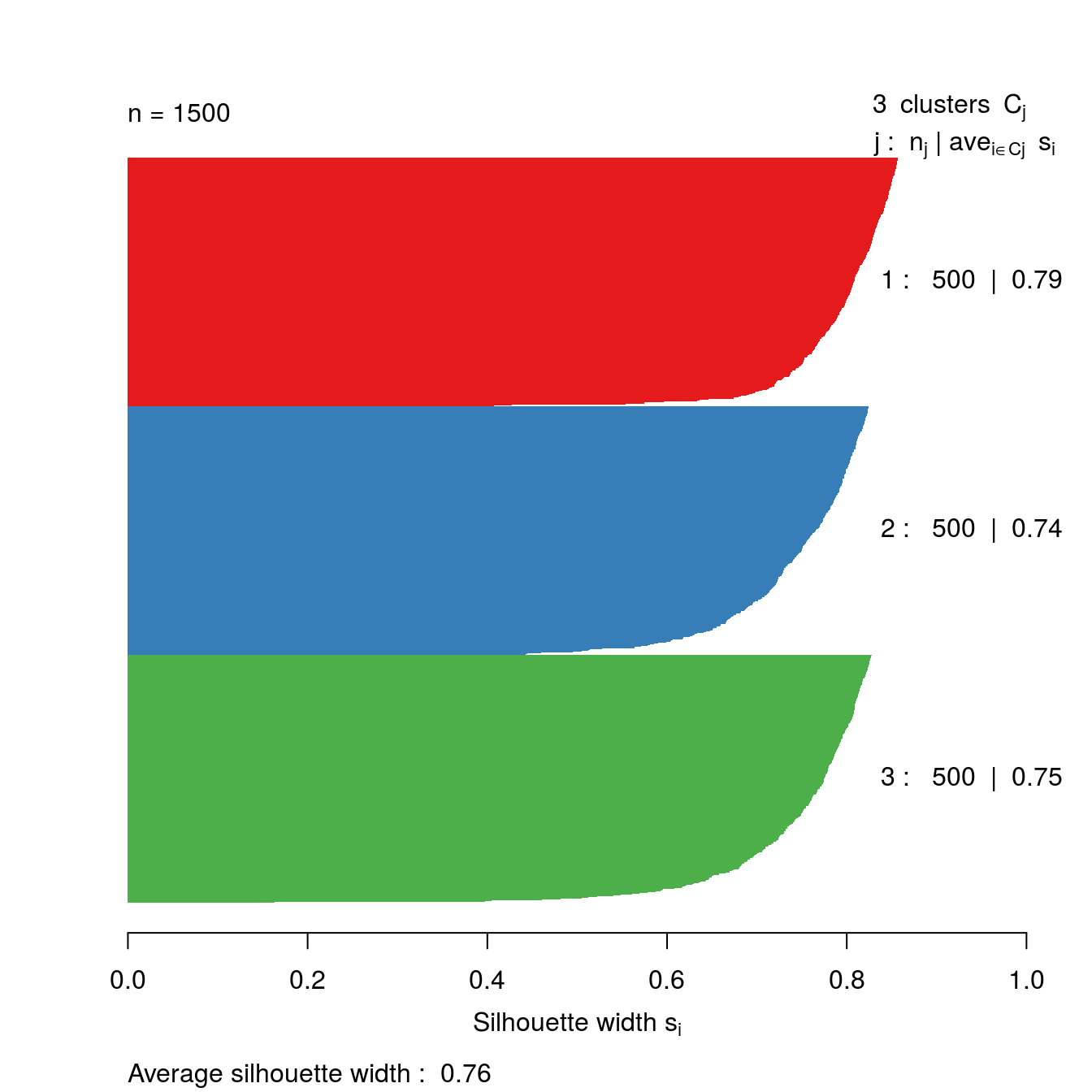
Figure 4.36: Silhouette plot for k-means clustering of the blobs data set with k=3.
So far the silhouette plots have shown that k=3 appears to be the optimum number of clusters, but we should investigate the silhouette coefficients at other values of k. Rather than produce a silhouette plot for each value of k, we can get a useful summary by making a barplot of average silhouette coefficients.
First we will calculate the silhouette coefficient for every observation (we need to index our list of kmeans outputs by i-1, because we are counting from k=2 ).
s <- lapply(k, function(i){silhouette(res[[i-1]]$cluster, d)})We can then calculate the mean silhouette coefficient for each value of k from 2 to 9.
avgS <- sapply(s, function(x){mean(x[,3])})Now we have the data we need to produce a barplot.
dat <- data.frame(k, avgS)
ggplot(data=dat, aes(x=k, y=avgS)) +
         geom_bar(stat="identity", fill="steelblue") +
  geom_text(aes(label=round(avgS,2)), vjust=1.6, color="white", size=3.5)+
  labs(y="Average silhouette coefficient") +
  scale_x_continuous(breaks=2:9) +
  theme_bw()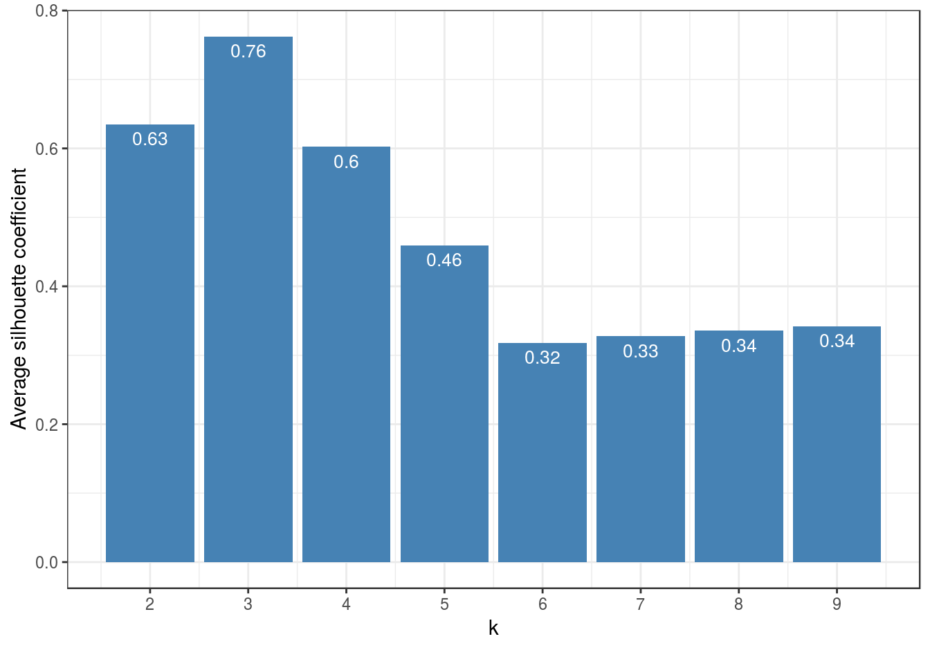
Figure 4.37: Barplot of the average silhouette coefficients resulting from k-means clustering of the blobs data-set using values of k from 1-9.
The bar plot (figure 4.37) confirms that the optimum number of clusters is three.
4.7.3 Example - DBSCAN clustering of noisy moons
The clusters that DBSCAN found in the noisy moons data set are shown in figure 4.27.
Let’s repeat clustering, because the original result is no longer in memory.
res <- dbscan::dbscan(noisy_moons[,1:2], eps=0.075, minPts = 10)Identify noise points as we do not want to include these in the silhouette analysis
# identify and remove noise points
noise <- res$cluster==0
Remove noise points from cluster results
clusters <- res$cluster[!noise]Generate distance matrix from noisy_moons data.frame, exluding noise points.
d <- dist(noisy_moons[!noise,1:2])Silhouette analysis
clusterColours <- brewer.pal(9,"Set1")
sil <- silhouette(clusters, d)
plot(sil, border=NA, col=clusterColours[sort(clusters)], main="")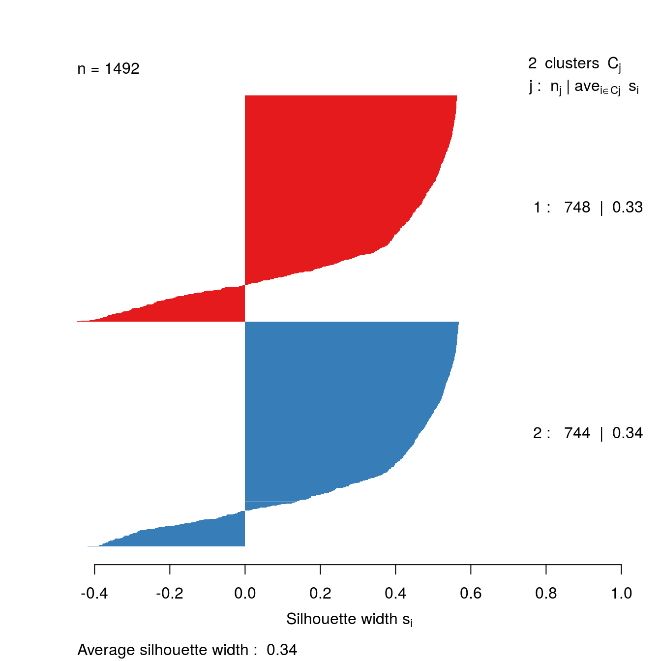
Figure 4.38: Silhouette plot for DBSCAN clustering of the noisy moons data set.
The silhouette analysis suggests that DBSCAN has found clusters of poor quality in the noisy moons data set. However, we saw by eye that it it did a good job of deliminiting the two clusters. The result demonstrates that the silhouette method is less useful when dealing with clusters that are defined by density, rather than inertia.
4.8 Example: gene expression profiling of human tissues
4.8.1 Hierarchic agglomerative
4.8.1.1 Basics
Load required libraries
library(RColorBrewer)
library(dendextend)
Load data
load("data/tissues_gene_expression/tissuesGeneExpression.rda")Inspect data
table(tissue)## tissue
## cerebellum colon endometrium hippocampus kidney liver
## 38 34 15 31 39 26
## placenta
## 6dim(e)## [1] 22215 189Compute distance between each sample
d <- dist(t(e))perform hierarchical clustering
hc <- hclust(d, method="average")
plot(hc, labels=tissue, cex=0.5, hang=-1, xlab="", sub="")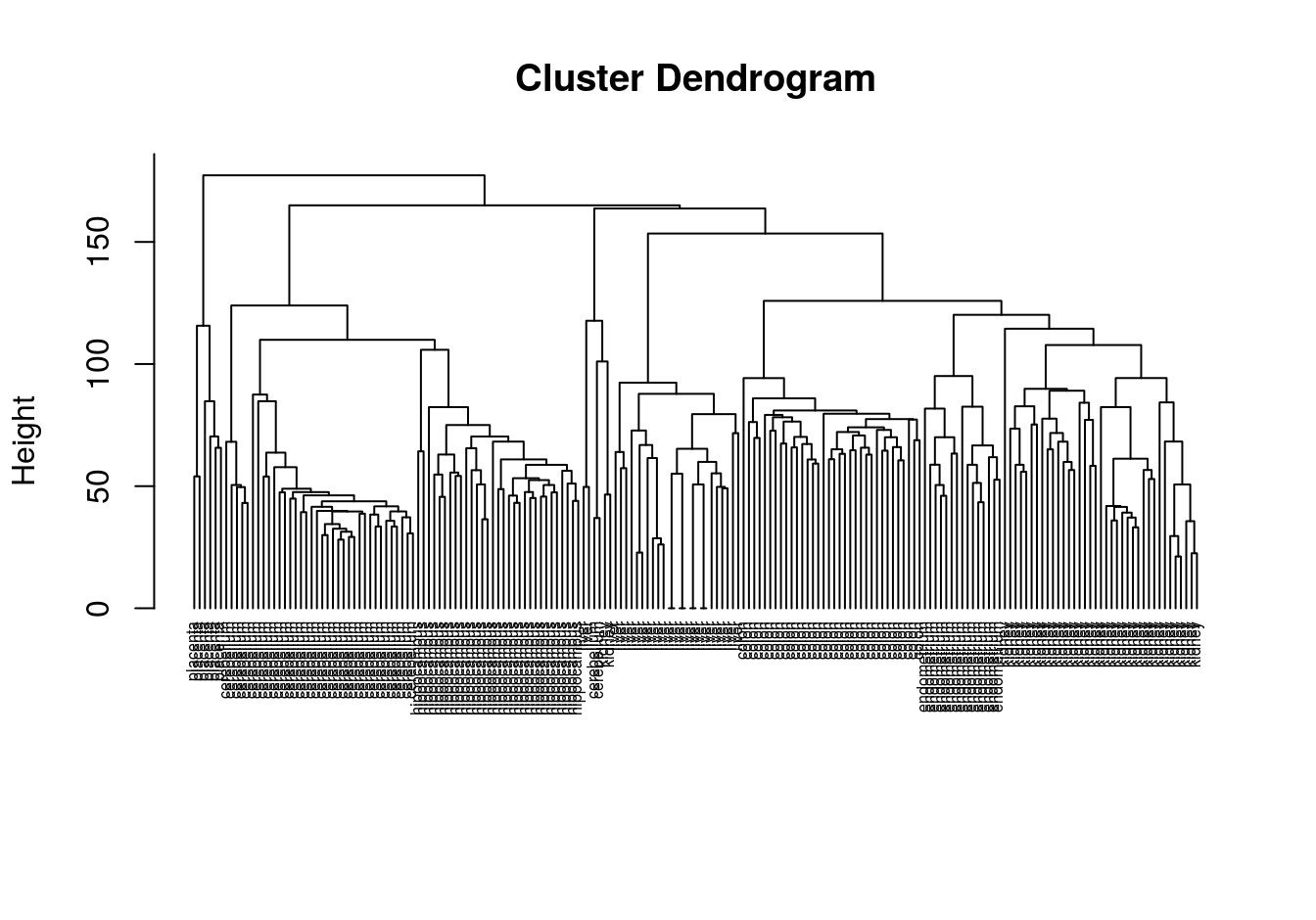
Figure 4.39: Clustering of tissue samples based on gene expression profiles.
4.8.1.2 Colour labels
The dendextend library can be used to plot dendrogram with colour labels
tissue_type <- unique(tissue)
dend <- as.dendrogram(hc)
dend_colours <- brewer.pal(length(unique(tissue)),"Dark2")
names(dend_colours) <- tissue_type
labels(dend) <- tissue[order.dendrogram(dend)]
labels_colors(dend) <- dend_colours[tissue][order.dendrogram(dend)]
labels_cex(dend) = 0.5
plot(dend, horiz=T)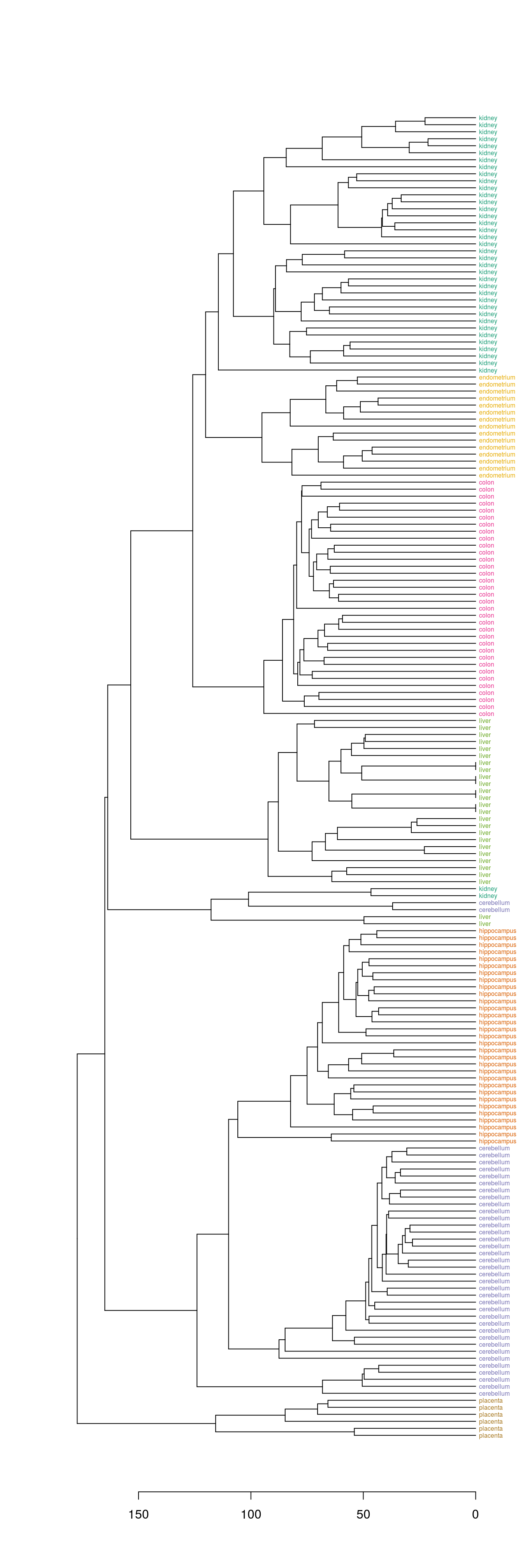
Figure 4.40: Clustering of tissue samples based on gene expression profiles with labels coloured by tissue type.
4.8.1.3 Defining clusters by cutting tree
Define clusters by cutting tree at a specific height
plot(dend, horiz=T)
abline(v=125, lwd=2, lty=2, col="blue")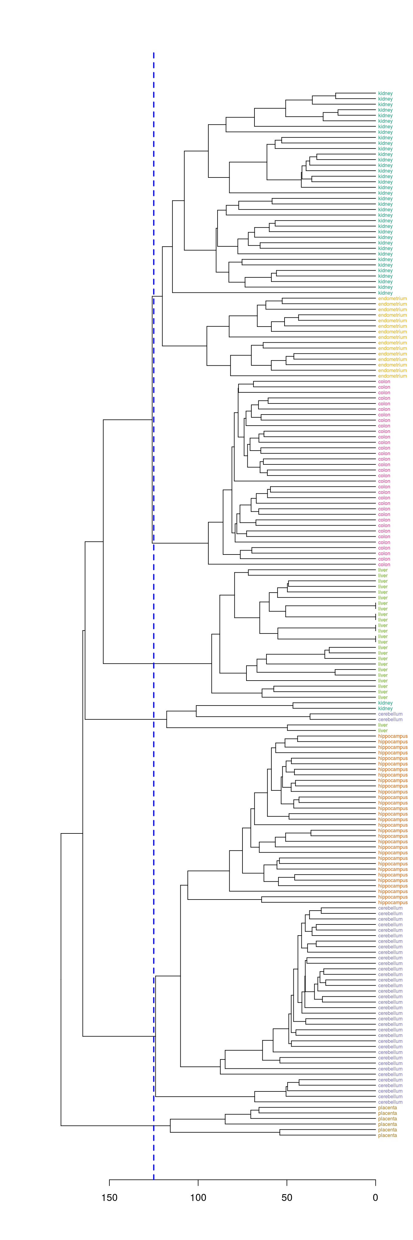
Figure 4.41: Clusters found by cutting tree at a height of 125
hclusters <- cutree(dend, h=125)
table(tissue, cluster=hclusters)
## cluster
## tissue 1 2 3 4 5 6
## cerebellum 0 36 0 0 2 0
## colon 0 0 34 0 0 0
## endometrium 15 0 0 0 0 0
## hippocampus 0 31 0 0 0 0
## kidney 37 0 0 0 2 0
## liver 0 0 0 24 2 0
## placenta 0 0 0 0 0 6Select a specific number of clusters.
plot(dend, horiz=T)
abline(v = heights_per_k.dendrogram(dend)["8"], lwd = 2, lty = 2, col = "blue")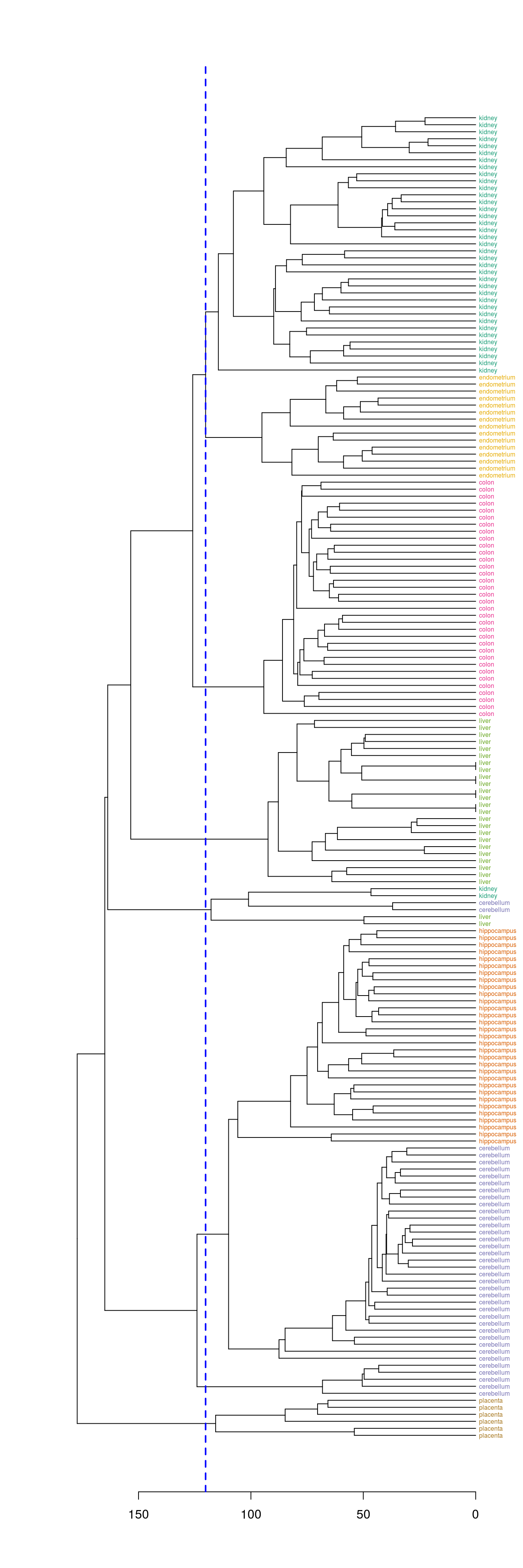
Figure 4.42: Selection of eight clusters from the dendogram
hclusters <- cutree(dend, k=8)
table(tissue, cluster=hclusters)
## cluster
## tissue 1 2 3 4 5 6 7 8
## cerebellum 0 31 0 0 2 0 5 0
## colon 0 0 34 0 0 0 0 0
## endometrium 0 0 0 0 0 15 0 0
## hippocampus 0 31 0 0 0 0 0 0
## kidney 37 0 0 0 2 0 0 0
## liver 0 0 0 24 2 0 0 0
## placenta 0 0 0 0 0 0 0 64.8.1.4 Heatmap
Base R provides a heatmap function, but we will use the more advanced heatmap.2 from the gplots package.
library(gplots)##
## Attaching package: 'gplots'## The following object is masked from 'package:stats':
##
## lowessDefine a colour palette (also known as a lookup table).
heatmap_colours <- colorRampPalette(brewer.pal(9, "PuBuGn"))(100)Calculate the variance of each gene.
geneVariance <- apply(e,1,var)Find the row numbers of the 40 genes with the highest variance.
idxTop40 <- order(-geneVariance)[1:40]Define colours for tissues.
tissueColours <- palette(brewer.pal(8, "Dark2"))[as.numeric(as.factor(tissue))]Plot heatmap.
heatmap.2(e[idxTop40,], labCol=tissue, trace="none",
          ColSideColors=tissueColours, col=heatmap_colours)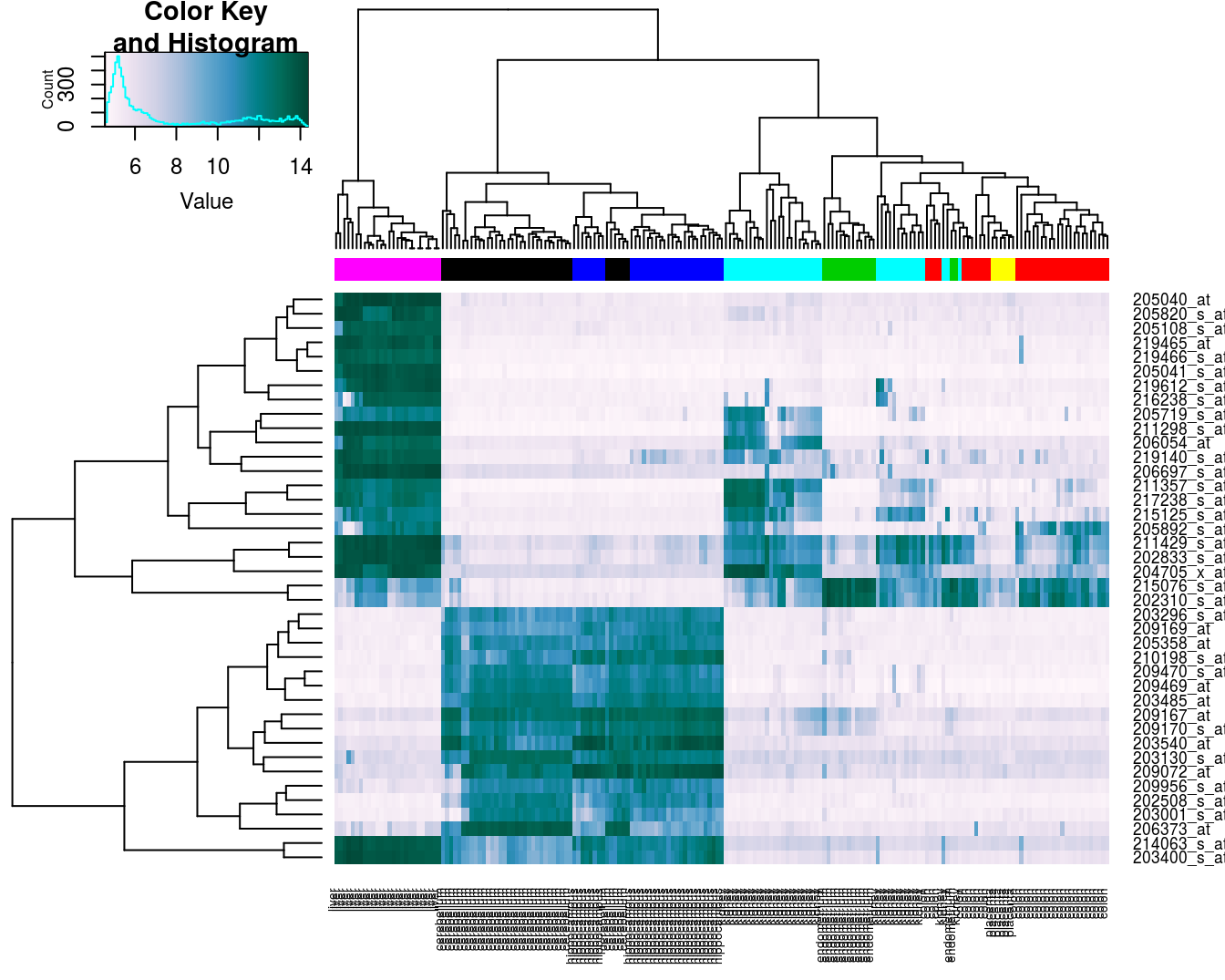
Figure 4.43: Heatmap of the expression of the 40 genes with the highest variance.
4.8.2 K-means
Load data if not already in workspace.
load("data/tissues_gene_expression/tissuesGeneExpression.rda")As we saw earlier, the data set contains expression levels for over 22,000 transcripts in seven tissues.
table(tissue)## tissue
## cerebellum colon endometrium hippocampus kidney liver
## 38 34 15 31 39 26
## placenta
## 6dim(e)## [1] 22215 189First we will examine the total intra-cluster variance with different values of k. Our data-set is fairly large, so clustering it for several values or k and with multiple random starting centres is computationally quite intensive. Fortunately the task readily lends itself to parallelization; we can assign the analysis of each ‘k’ to a different processing core. As we have seen in the previous chapters on supervised learning, caret has parallel processing built in and we simply have to load a package for multicore processing, such as doMC, and then register the number of cores we would like to use. Running kmeans in parallel is slightly more involved, but still very easy. We will start by loading doMC and registering all available cores:
library(doMC)## Loading required package: foreach## Loading required package: iterators## Loading required package: parallelregisterDoMC(detectCores())To find out how many cores we have registered we can use:
getDoParWorkers()## [1] 8Instead of using the lapply function to vectorize our code, we will instead use the parallel equivalent, foreach. Like lapply, foreach returns a list by default. For this example we have set a seed, rather than generate a random number, for the sake of reproducibility. Ordinarily we would omit set.seed(42) and .options.multicore=list(set.seed=FALSE).
k<-1:15
set.seed(42)
res_k_15 <- foreach(
  i=k,
  .options.multicore=list(set.seed=FALSE)) %dopar% kmeans(t(e), i, nstart=10)
plot_tot_withinss(res_k_15)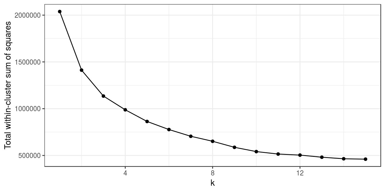
Figure 4.44: K-means clustering of human tissue gene expression: variance within clusters.
There is no obvious elbow, but since we know that there are seven tissues in the data set we will try k=7.
table(tissue, res_k_15[[7]]$cluster)##
## tissue 1 2 3 4 5 6 7
## cerebellum 0 0 0 33 0 0 5
## colon 0 0 0 0 0 34 0
## endometrium 0 0 0 0 15 0 0
## hippocampus 0 0 0 0 0 0 31
## kidney 0 0 39 0 0 0 0
## liver 26 0 0 0 0 0 0
## placenta 0 6 0 0 0 0 0The analysis has found a distinct cluster for each tissue and therefore performed slightly better than the earlier hierarchical clustering analysis, which placed endometrium and kidney observations in the same cluster.
To visualize the result in a 2D scatter plot we first need to apply dimensionality reduction. We will use principal component analysis (PCA), which was described in chapter 3.
pca <- prcomp(t(e))
ggplot(data=as.data.frame(pca$x), aes(PC1,PC2)) +
  geom_point(col=brewer.pal(7,"Dark2")[res_k_15[[7]]$cluster],
             shape=c(49:55)[res_k_15[[7]]$cluster], size=5) +
  theme_bw()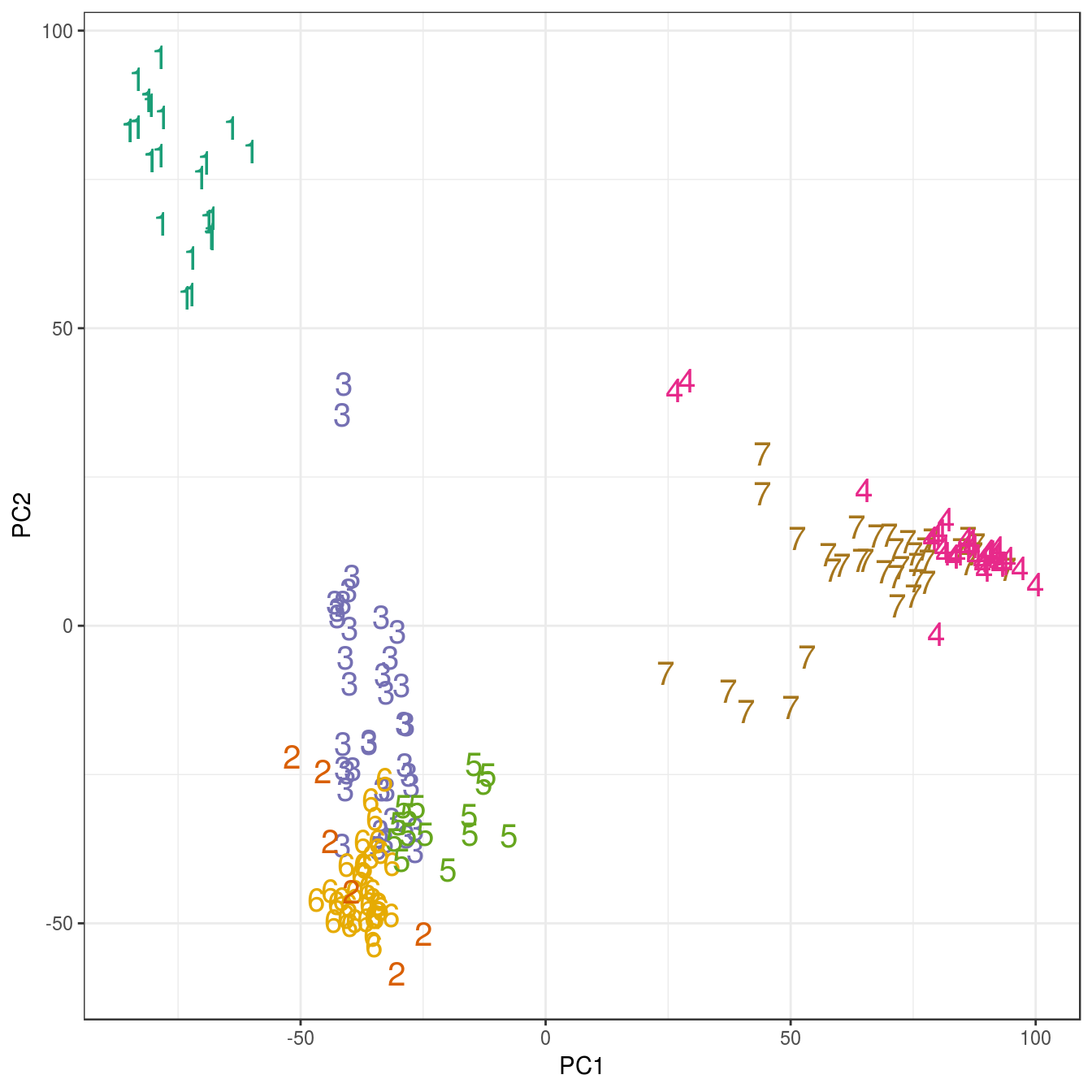
Figure 4.45: K-means clustering of human gene expression (k=7): scatterplot of first two principal components.
4.8.3 DBSCAN
Load data if not already in workspace.
load("data/tissues_gene_expression/tissuesGeneExpression.rda")Get a summary of the data set.
table(tissue)## tissue
## cerebellum colon endometrium hippocampus kidney liver
## 38 34 15 31 39 26
## placenta
## 6We’ll try k=5 (default for dbscan), because there are only six observations for placenta.
kNNdistplot(t(e), k=5)
abline(h=85)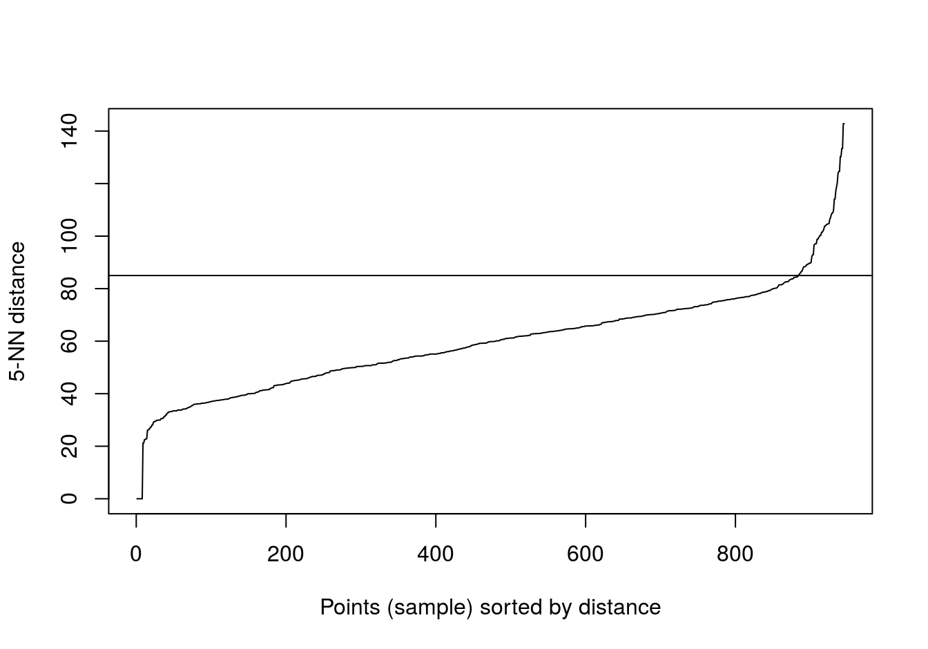
Figure 4.46: Five-nearest neighbour distances for the gene expression profiling of human tissues data set.
set.seed(42)
res <- dbscan::dbscan(t(e), eps=85, minPts=5)
table(res$cluster)
##
## 0 1 2 3 4 5 6
## 12 37 62 34 24 15 5table(tissue, res$cluster)##
## tissue 0 1 2 3 4 5 6
## cerebellum 2 0 31 0 0 0 5
## colon 0 0 0 34 0 0 0
## endometrium 0 0 0 0 0 15 0
## hippocampus 0 0 31 0 0 0 0
## kidney 2 37 0 0 0 0 0
## liver 2 0 0 0 24 0 0
## placenta 6 0 0 0 0 0 0pca <- prcomp(t(e))
ggplot(data=as.data.frame(pca$x), aes(PC1,PC2)) +
geom_point(col=brewer.pal(8,"Dark2")[c(8,1:7)][res$cluster+1],
shape=c(48:55)[res$cluster+1], size=5) +
theme_bw()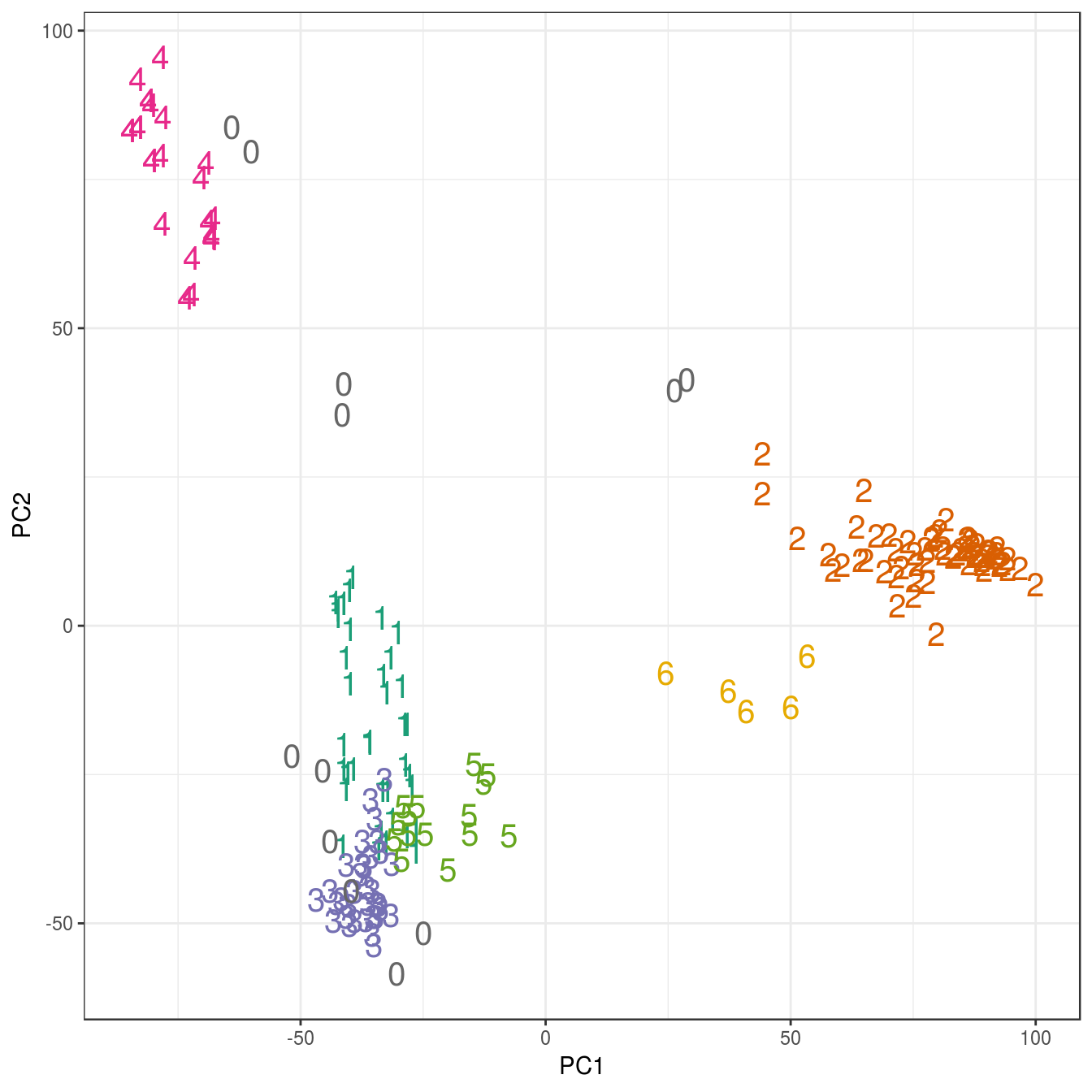
Figure 4.47: Clustering of human tissue gene expression: scatterplot of first two principal components.
4.9 Exercises
4.9.1 Exercise 1
Image segmentation is used to partition digital images into distinct regions containing pixels with similar attributes. Applications include identifying objects or structures in biomedical images. The aim of this exercise is to use k-means clustering to segment the image of a histological section of lung tissue (figure 4.48) into distinct biological structures, based on pixel colour.
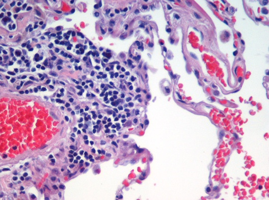
Figure 4.48: Image of haematoxylin and eosin (H&E) stained section of lung tissue from a patient with end-stage emphysema. CC BY 2.0, https://commons.wikimedia.org/w/index.php?curid=437645.
The haematoxylin and eosin (H & E) staining reveals four types of biological objects, identified by the following colours:
- blue-purple: cell nuclei
- red: red blood cells
- pink: other cell bodies and extracellular material
- white: air spaces
Consider the following questions:
- Can k-means clustering find the four biological objects in the image based on pixel colour?
- Earlier we saw that if we plot the total within-cluster sum of squares against k, the position of the “elbow” is a useful guide to choosing the appropriate value of k (see section 4.4.3. According to the “elbow” method, how many distinct clusters (colours) of pixels are present in the image?
Hints: If you haven’t worked with images in R before, you may find the following information helpful.
The package EBImage provides a suite of tools for working with images. We will use it to read the file containing the image of the lung section.
library(EBImage)##
## Attaching package: 'EBImage'## The following object is masked from 'package:dendextend':
##
## rotatelibrary(methods)
img <- readImage("data/histology/Emphysema_H_and_E.jpg")img is an object of the EBImage class Image; it is essentially a multidimensional array containing the pixel intensities. To see the dimensions of the array, run:
dim(img)## [1] 528 393 3In the case of this colour image, the array is 3-dimensional with 528 x 393 x 3 elements. These dimensions correspond to the image width (in pixels), image height and number of colour channels, respectively. The colour channels are red, green and blue (RGB).
Before we can cluster the pixels on colour, we need to convert the 3D array into a 2D data.frame (or matrix). Specifically, we require a data.frame (or matrix) where rows represent pixels and there is a column for the intensity of each of the three colour channels. We also need columns for the x and y coordinates of each pixel.
imgDim <- dim(img)
imgDF <- data.frame(
  x = rep(1:imgDim[1], imgDim[2]),
  y = rep(imgDim[2]:1, each=imgDim[1]),
  r = as.vector(img[,,1]),
  g = as.vector(img[,,2]),
  b = as.vector(img[,,3])
)
If the data in imgDF are correct, we should be able to display the image using ggplot:
ggplot(data = imgDF, aes(x = x, y = y)) +
  geom_point(colour = rgb(imgDF[c("r", "g", "b")])) +
  xlab("x") +
  ylab("y") +
  theme_minimal()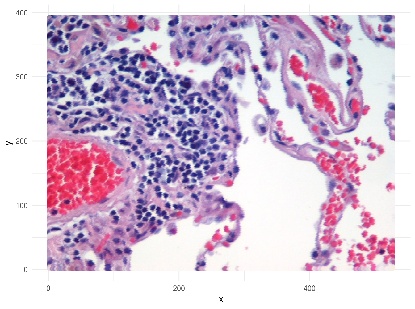
Figure 4.49: Image of lung tissue recreated from reshaped data.
This should be all the information you need to perform this exercise.
Solutions to exercises can be found in appendix C.
K Solutions for use case 2
Gionis, A., H. Mannila, and P. Tsaparas. 2007. “Clustering aggregation.” ACM Transactions on Knowledge Discovery from Data (TKDD) 1 (1): 1–30.
Schubert, Erich, Jörg Sander, Martin Ester, Hans Peter Kriegel, and Xiaowei Xu. 2017. “DBSCAN Revisited, Revisited: Why and How You Should (Still) Use Dbscan.” ACM Trans. Database Syst. 42 (3): 19:1–19:21. doi:10.1145/3068335.